Hacker News new | ask | show | jobs
by rvieira 986 days ago
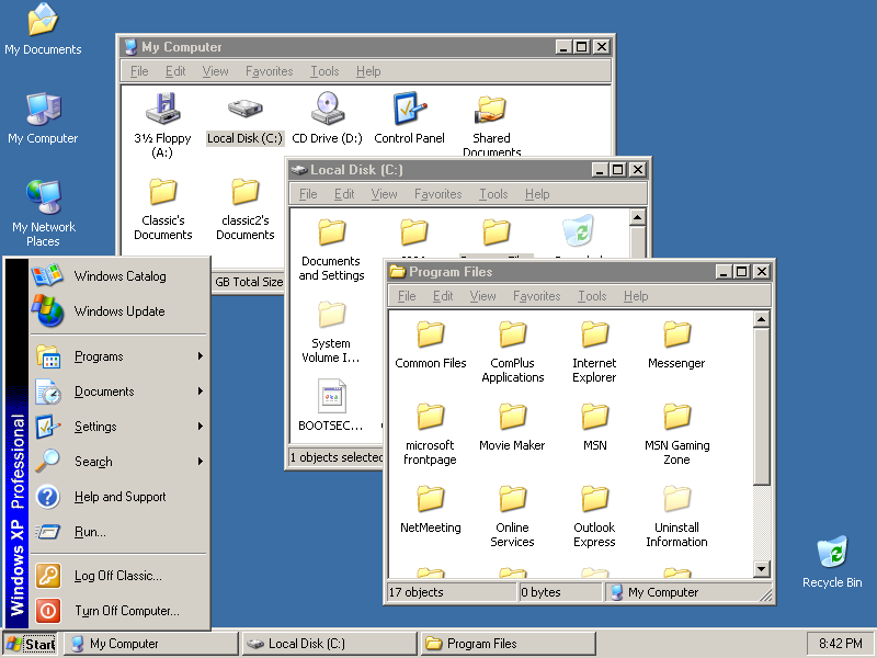
There's always a degree of subjectivity and personal taste, but I do consider this to be the peak of OS UIs.

I have an "ironic" machine at home that is an old retina iMac, with Linux installed and themed with Chicago95. My attempt at a machine with a nice hardware, nice OS and nice UI :)

6 comments

Windows 2000 might be the actual peak. It took the good parts of Windows 95 and 98 and combined them into something quite excellent.

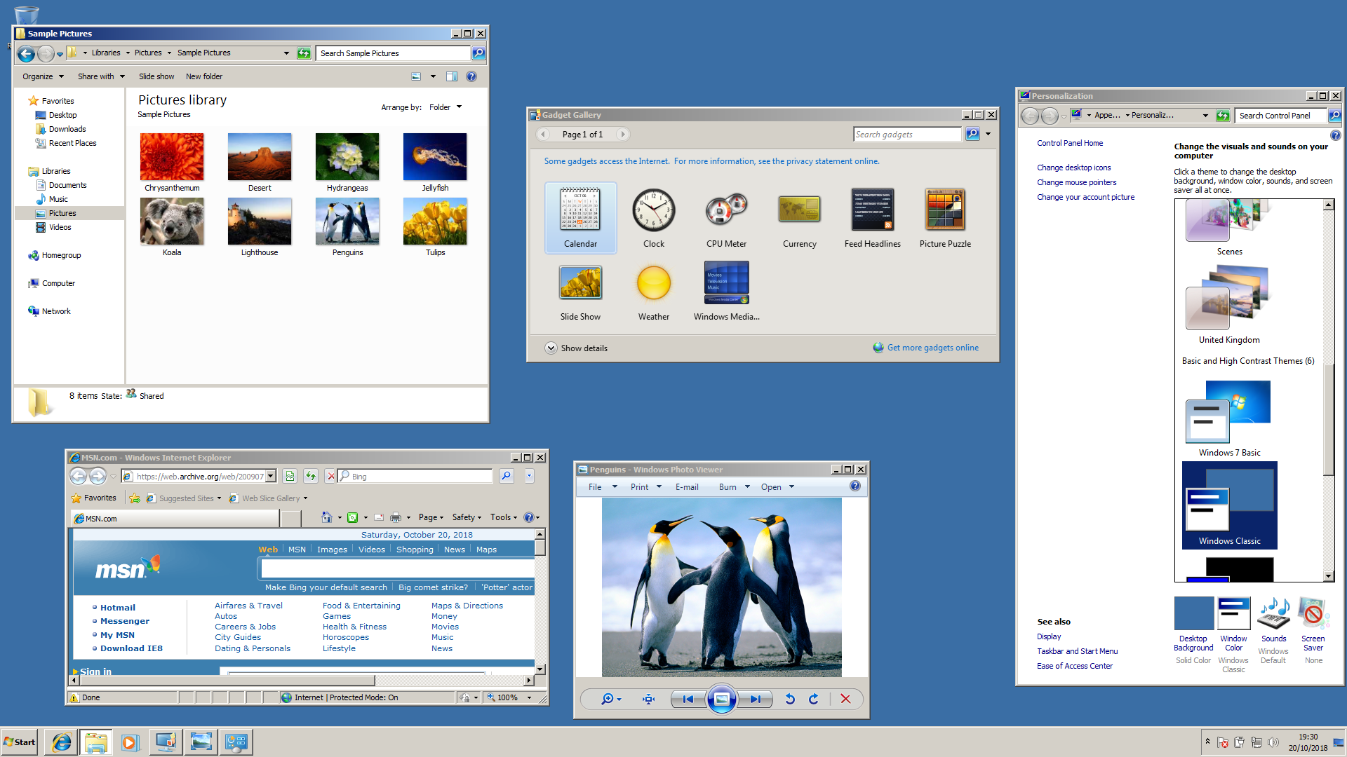
All downhill ever since.

I agree with the choice of Windows 2000. The reaction to Windows XP was that it was too videogamish with its choice of colors and bezels. Then it lasted for so many years past Vista and in part Windows 8 that it became the reference Windows interface. Then the flat UIs mimicking the web and also the 80s with simple elements (we couldn't do complicated widgets back then, not enough pixels.)
Win XP with classic look was pretty decent and useable. There was an option in system settings to disable all theming, 3D stuff, animations etc. just the basic look of that time and a lot more snappy UX.
Do you have a picture of what that looked like? I'm curious. When I search for it, I can only find pictures of normal Windows XP and older versions of Windows. I can only imagine it looking like Windows 95 again.
Not easy to find, anyway here is a small one: http://toastytech.com/guis/wxpclassic.png

Here is a blog post that explains how and why: http://softwaretracker.blogspot.com/2007/08/improve-windows-...

Thanks, that's exactly what I wanted. It did look slightly nicer than the Windows 95 pictures here.
Classic style actually worked up to and including Windows 7:

https://betawiki.net/images/d/da/Windows_7_classic_theme.png

Thanks for letting me know. I looked into it, and apparently it's still even possible to activate on later versions of Windows with registry edits and helper software: https://github.com/valinet/ExplorerPatcher/discussions/167
I avoided the XP Luna theme as best I could when it was new, but now I look back at it and realize it was pretty good.

At least I could tell where the scrollbar was.

Windows still has the Classic Theme; it's just hidden. https://old.reddit.com/r/windows/comments/11qq0qi/why_did_mi...
Also took the good parts from Windows NT. I loved using Windows 2000. I remember being really mad when XP came out and it added all the colourful and curvy GUI elements - felt really dumbed down.
> Also took the good parts from Windows NT.

It is Windows NT 5.0

https://en.wikipedia.org/wiki/Windows_NT#Releases

And XP was Windows NT 5.1 (as also seen in your link)
Got an old Dell running Windows 2000. Its remarkable how responsive the UI is. I open an Explorer window, it paints instantly. The Start Menu pops up completely drawn in a fraction of a second. Windows 11 on a monster machine is sluggish by comparison -- I can feel it drawing each window I open.
I was just having the argument the other that dragging windows on Haiku on a plain old unaccelerated framebuffer just feels an order of magnitude faster than dragging windows around on Windows 11 with all acceleration enabled. On a 5K monitor. Windows is not setting a very high bar these days.
USB support even.
I miss being able to tell what’s a button. And what state it’s in.

It is kinda funny that a style that looks like one of those bad UIs a stereotypical doesn’t-know-GUI programmer might have made as a stand-in before the actual designers could make it good, is what’s in vogue. Finally, even I can make a “good” UI! Thanks, flat design.

I agree with you. Buttons were immediately identifiable as such, menus had keyboard shortcuts visible everywhere, all items always looked the same across all apps, and everything was really snappy.

We've really gone backwards since.

Aqua (in early versions of OS X) did a fantastic job of combining all this clear usability with a lot of fun visual flair. Even the old Qt/GTK themes which emulated that look were pretty good.

It really is incredible how flat and boring modern macOS is.

At some point "skeuomorph" design went out of fashion, and everything had to be flat and simple. I think it all started with the Microsoft Zune (an MP3 player), which influenced Windows Phone, which influenced Windows 8. Then came iOS 7, and finally Android 5. I actually don't know when Mac OS went "flat". I only know ever since that time it is regularly unclear what a "button" is, as it doesn't look like a button.
If you're interested, see https://hn.algolia.com/?dateEnd=1388534400&dateRange=custom&...

Ironically, back in 2012 I remember people were expressing their distaste for the skeuomorphic design of iOS and macOS.

> I think it all started with the Microsoft Zune (an MP3 player)

And its companion desktop application ca. 2009: https://www.neowin.net/news/flashback-microsofts-zune-hd-tur...

And it even matched the hardware back then. You could have the colorful blue Aqua theme to match for example the iMac G3 or the graphite appearance to match the design of the Power Macs back then.

https://arstechnica.com/gadgets/2010/09/macos-x-beta/4/

Ah, I didn't have a Mac back then, but I can definitely believe that.
I always loved the Solaris Nimbus GTK theme. It was one of the most polished GTK2 themes around. https://www.gnome-look.org/p/1080244
I’m primarily a Mac user (from the 80s until now minus a Linux break), but still think Win98SE was the best OS ever made.

The UI was flawless. Fast/responsive even on low spec PCs, cohesive design across the entire OS, logically laid out, and minimal while still giving access to everything you needed within a couple clicks.

All OSes these days are just a bloated mess.

Peak UI happened with OS/2 Warp 3, but, yes. Everything went downhill after the Great Skeumorphic Rebellion of 2010.

OS X 10.0 dug too greedily, and too deep.

I too appreciate minimalist OS UI.

I believe that graphical polish is just a distraction. It's part of why I like reading this site!

When I have time to waste, I am happy to have something pretty and shiny to work with. For professional work, I want my OS to be snappy and without distractions.