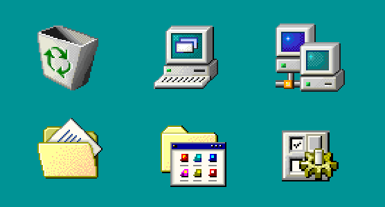
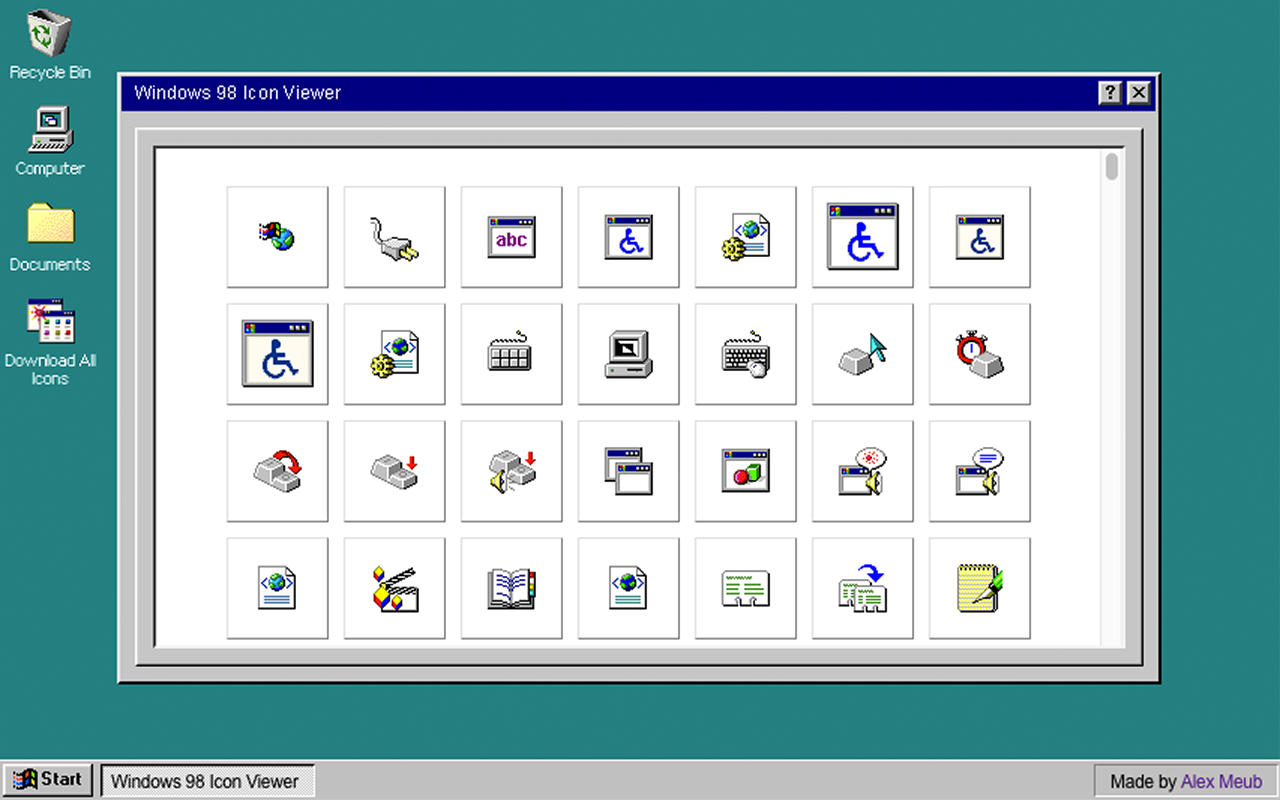
I love pixel art, used Win 98 as my first OS and still find them ugly as hell. The colors are sad, the perspective is off, and on the first image[1], only 2 icons out of 6 make any sense to me (the trash and the folder). On the second image[2] I understand the wheelchair and the notepad but that's it. These icons aren't inherently easier to understand.