The GINI coefficient for Germany is about 32 vs 41 in the US with the global average being 38. That's not so far apart, and the US is skewed by have a chunk of the world's wealthiest people.
It's hard to take two numbers in isolation that we don't really use day to day and make any kind of sense of them. It's only when you graph a few countries together[0] that you see:
1. the US is somewhat of an outlier, while Germany is grouped together with other wealthy countries
2. the US' Gini has been steadily growing last few decades - implying inequality is getting worse
3. Germany's Gini is very slightly declining in the last few decades - implying it's staying roughly stable
I don't think higher-than-average is particularly good at all - you're in the neighbourhood of places like Qatar, Iran, DRC and Argentina. In fact the only way you'd use Gini to suggest the US has a ok level of wealth inequality is if you presented two countries Gini coefficients side-by-side to someone who doesn't normally think about Gini, presented them without any other context and said "look, they're kinda close"
What I'm getting at is that Germany isn't some paragon of equality, it's average. The US as I pointed out is skewed by the high number of staggeringly wealthy people and a trend of people moving from the lower to upper levels of what you might call middle class. In the US wealth held by people form 50% of the distribution up to 99% represents about $91T vs $18.2T for the top 0.1% and $4.4T for the bottom 50%. The coefficient really hides the vast middle and upper middle distribution in the US.
Also this obscures the fact that it is far better to be poor or working class in the US than somewhere with a similar Gini coefficient.
> The US as I pointed out is skewed by the high number of staggeringly wealthy people
I think you might want to lookup what Gini tries to measure. You used Gini as a way to suggest the USA isn't so bad, and now you're having to backpedal and say that actually Gini kinda sucks but the USA isn't so bad.
> You used Gini as a way to suggest the USA isn't so bad
No, I'm pointing out that at lot was being made of a small difference in a ratio that's really sensitive to marginal differences. I'm noting a marginal difference that makes the US look more different than other OCED nations than it is in fact and more like autocratic developing nations than it is in fact.
I'm also pointing out that it isn't a good measure at all. It's as coarse as GDP and more misleading.
Sure, that makes sense. It's just worth noting that the U.S. are not an outlier amongst developed nations when looking at wealth inequality -- which, IMO, is the much more important metric.
Not really. The US attracts wealthy people from around the world, has a gigantic internal market, and is friendly to financial business. If you don't consider the top 0.1% then the picture looks totally different. The VAST majority of wealth in the US is help by people in 50th to 99th percentile range. The Gini coefficient makes the US look superficially more like Qatar, which is obviously nonsense.
Some metrics aren't linear so w/o knowing more about Gini coefficient, my first thought is "I have no idea if the difference is significant or not". Can someone ELI5 this so that I can build an intuition for what "1 unit of Gini" means?
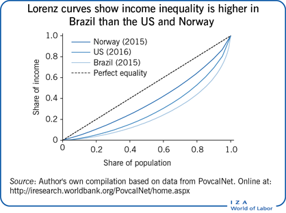
It's a curve reflecting income (not wealth) share of a population against a line of perfect equality, which is a 45 degree angle. A low disparity hugs the line and a high disparity hugs the X and Y axis. Gini = A/(A + B) where A is area over the curve and B is the area under the curve. So an increase of 0.1 in the gini number reflects a larger A.
It's not a very good way to measure what it is trying to measure[1].
I think the main problem is the lack of intuition of what "1 Gini means", except the "lower is better". Is difference between coefficient of 10 & 11 the same as difference between 30 and 31? The poster to which I responded said that "32 vs 41 is not far apart" - is it? Is difference between 10 and 19 the same as difference between 32 and 41 (delta is the same)? How about between 0 and 9?
That was me, and they aren't that far apart. Is 41% of the area under a lot more than 32%? Not really, see this example[1] Norway here has a coefficient of 27.5 and the US was at 41.2 but the graphs are barely different except that you can see that the US has a sharp bend on the far right hand side. The gini formula is really sensitive to that in a way that doesn't tell us much.
1. the US is somewhat of an outlier, while Germany is grouped together with other wealthy countries
2. the US' Gini has been steadily growing last few decades - implying inequality is getting worse
3. Germany's Gini is very slightly declining in the last few decades - implying it's staying roughly stable
I don't think higher-than-average is particularly good at all - you're in the neighbourhood of places like Qatar, Iran, DRC and Argentina. In fact the only way you'd use Gini to suggest the US has a ok level of wealth inequality is if you presented two countries Gini coefficients side-by-side to someone who doesn't normally think about Gini, presented them without any other context and said "look, they're kinda close"
[0] - https://en.wikipedia.org/wiki/Gini_coefficient#/media/File:G...