|
|
|
|
|
|
by wenc
1492 days ago
|
|
|
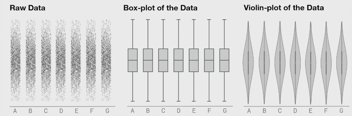
I would caution against this approach in general (unless you’re working with unusually uniform data from a deterministic source — in my world that is rarely the case). Summary statistics are useful but taken in isolation they can mislead. One loses the ability to get a feel for interesting non-aggregated phenomenon. I find it’s important to actually “touch” the raw data even if only in a buffered, random sampling sort of way to get a feel for it. Sometimes with big datasets, looking through rows of data feels tedious and meaningless but I’ve found that I’ve often picked up on things I wouldn’t have without actually looking at the raw data. Raw data is often flawed, but there’s often some signal in it that tells a story hence it’s important not to overlook these through a lens of aggregate statistics. The next step is to visualize the data multidimensionally in something like Tableau. Tableau works on very large datasets (it has an internal columnstore format called Hyper) and can dynamically disaggregate and drill down. Insights are usually obtained by looking at details, not aggregates. |
|
|
https://en.wikipedia.org/wiki/Anscombe's_quartet