Hacker News new | ask | show | jobs
by rland 1506 days ago
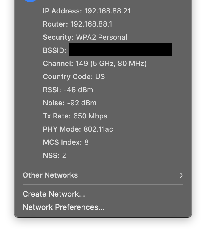
MacOS is full of these UI "tricks" that remain undiscovered by 99% of users because they are:

- not obvious

- not discoverable

For example: if you hold option when you click the Wifi button, you actually can view a lot of information about the Wifi networks you are connecting to. This is invaluable when you're dealing with a Wifi issue, and completely undiscoverable!

I think MacOS is a perfectly usable operating system... If you're god and can somehow "just know" all of these hidden secrets.

8 comments

The option key works on many menubar items and also on menus.

For menus you can even press the button while it's open to see the items that change their behaviour with the option key. And it sometimes extends to keyboard shortcuts. For example, for logging out you can use shift-cmd-q and you will get a window with a choice, holding option along will log you out directly. In the menu this is shown by having '...' or not.

And on the topic of windows, you can cmd-click the titlebar of a window that is not the front most one and move it around whilst keeping it in the background.

It's an interesting definition of "usable" that is qualified on behavior that so many people didn't even know existed, it's worth the top of the front page of HN. In at least some of these cases, the tricks are hidden because they're not useful, and thus don't pay their cognitive freight, for most people.
I look forward to tomorrow's HN posts: "maximize a window by double clicking the title bar" and "secrets of the alt-space menu revealed!"
> full of these UI "tricks" that remain undiscovered by 99% of users

What percentage of users can actually make useful decisions based on the advanced WiFi info? Here's a screenshot for example: https://dl.dropboxusercontent.com/s/227iup97ivdaurw/Screen%2...

I suspect it's around 1%, and most of those 1% already know about the hold option trick (which works on many menus). I agree with you it's frustrating how this useful information is obscured, but I also think this is a reasonable compromise for Apple as they try to balance power with usability and simplicity for the sake of the non-technical majority.

To be fair: Most of them are documented in Apples manual. If you open the macOS help on "Manage app windows" you will find all the tricks about moving and resizing discussed here. Or your WiFi trick is mentioned in the help article about debugging your WiFi connection.

The builtin help and documentation on macOS is surprisingly good. Especially if you compare it to Windows. Today was the first day I looked at it. The last 10 years on Windows taught me that the help outside of technet and Office is useless and I assumed this is also true for macOS. I guess I was wrong and I should have read the manual.

I agree. A good GUI can be all things for all users. Keyboard shortcuts can be unknown to a user when they need it the most, and accidentally triggered by a clumsy novice user who could damage their system configuration. Apple's competitors have approaches that, in my opinion, are much better:

In Android, Google often hides advanced functionality under overflow menus. These menus have a 3-dot icon (implying more menu options) or a settings gear, so most users will check them when the visible options aren't satisfactory. In recent Android releases, a lot of settings have clear and concise descriptions so users can understand their impact.

In Windows, Microsoft prefers to use a "properties" or "advanced options" menu, which also works well. If you can't find a desired option in the surface menus, you can dig into those menus.

Both of these approaches do a good job of offering more settings when needed while also warning users that the options can cause undesired effects. Android has clear settings descriptions so it's difficult to make a mistake, and when important settings like a debugging dump are triggered, will also display a clear warning about private information or breaking apps. Windows uses an "advanced" menu that can warn away "mom and pop"/novice users who could dig themselves into a hole. In both cases, there's some precautions to prevent users from mistakenly changing critical settings.

That Wi-Fi button truck also works with the volume and Bluetooth buttons. You can also quickly toggle focus mode by option clicking on the time (or the Notification Center button)
Meanwhile on Windows, the same functionality for choosing which output you want to use is accessible by just clicking the dang volume icon

Why does MacOS hide such a useful feature behind an obscure trick?

It’s also a normal click in macOS to change the output device. Option + Click is only needed when you want to change the input device without changing the output device
What? Just clicking on macOS's volume icon lets you change the output.
Interesting, on my macbook it doesn't display anything. Must just be hiding output options because I have only the built in speakers. Shucks I can't delete or edit the comment now :(
Option clicking the menu in some Apps like Mail or Safari brings up „secret“ menu items as well. (mainly for debugging)
With a wide range of technical savviness among users, macOS tries its best to make everyone happy and IMO does a pretty decent job at it. It's loved by programmers and grandmas alike. Can't really say that about Linux or Windows.
My wife is non-technical and uses Linux Desktop (KDE) every day and prefers it to the sometimes weirdness of Windows. We never used Mac and have no desire to.
Every time I get a new Mac, I need to search again for how to show hidden files
Now it's a shortcut away,

CMD + Shift + .

Hidden shortcut :)