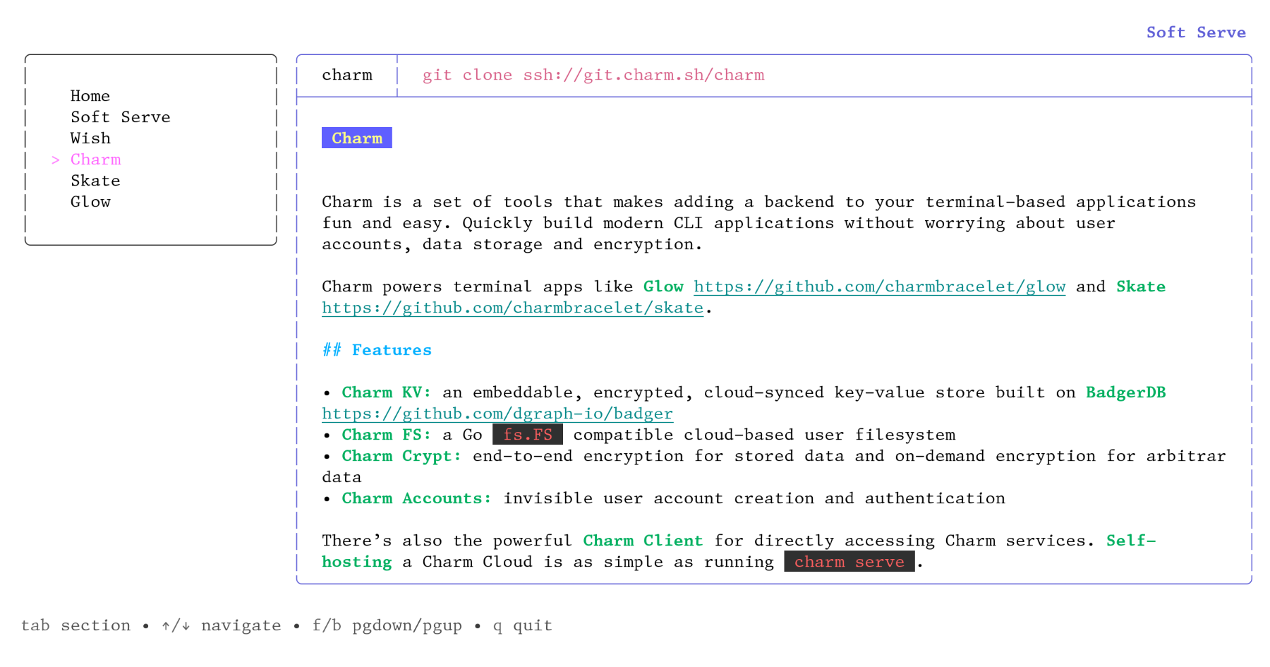
| I have one major problem with a lot of the recent TUI stuff that’s been happening: it almost always assumes dark terminal, and uses techniques that work poorly or terribly on light terminals. For example: bat’s default colour scheme uses white text for the contents of files except where syntax highlighting changes it. Not the default colour, but white. This makes it completely unusable for me without --theme=ansi (which can go in ~/.config/bat/config), because the text is literally invisible unless I highlight it. This is an idiotic or thoughtless default. The fact of the matter is that you can’t reliably do anything even vaguely interesting in colours, because clients are too inconsistent. Do the bright codes higher contrast, or do they mean lighter? Different programs and different themes treat them different ways, and the effects matter greatly. This particular app is mostly not too objectionable in my high-contrast light colour scheme, but there are a few places where it’s clearly not what was intended and doesn’t work as well, though still tolerable. Pane focus outline is a fair way off so that it’s much less obvious, and some of the colour choices grate. Markdown `code` highlighting, which is supposed to be salmon-coloured with a subtle lightening background, is way off and quite painful. Screenshot: <https://temp.chrismorgan.info/2022-01-24-git.charm.sh-in-lig...>. It’s all particularly bad for me with a light terminal, but I imagine it’ll look at least mildly dodgy even on many dark colour schemes. There are no satisfactory choices in designing TUIs with colour. You can: stick to 5–6 colours plus bold and have it work pretty well for everyone but miss out on some desirable possibilities; go up towards 16 and have it start to not work properly for more people (e.g. blue could be clearly visible, or nigh-invisible against black and just about painful to read); use 256 or 24-bit and design for a particular background and character of colour scheme, and feel badly out of place on other sorts of colour schemes and work really badly in other sorts of backgrounds, especially as you can’t predict whether a lighter colour means higher or lower contrast; or specify the background colour (only even vaguely reasonable for full-screen TUIs) and badly annoy a lot of people. It’s unfortunately a dead end for design as it stands: ANSI colour codes are just very insufficient. Things could be improved if apps at least tried detecting the terminal’s default foreground and background colours (printf "\033]10;?\033\\" and "\033]11;?\033\\") and adjusted things if that works, but you’re still just fundamentally quite limited in what’s possible. |
https://github.com/charmbracelet/lipgloss#adaptive-colors