Actually this blog post I think is a perfect example of how "designers" in the large don't get it. The ribbon was largely maligned for Office too by the web intelligencia, but as someone who spent time in the enterprise both consulting and selling apps, the ribbon is generally loved by its users. The people who hate the ribbon are the people who use OSX. Try giving Word 2003 to anyone who has spent any time with Word 2010 and you'll be seriously reprimanded.
For example, Had they performed a deeper analysis of the motivations and needs of the users, they would most probably have ended up with a completely different solution. They might have had a solution that wouldn’t be held back by assumptions and limitations made in earlier versions of the application.
This article assumes that this is the second version of Windows ever shipped. They assume that this research hasn't taken place at all in the past. That the existing set of functionality hasn't evolved over time. For example the Win7 task bar is the result of this evolution. File managers are a very specific beast though. I get the feeling the author of the blog post doesn't know them very well.
And the author concludes comparing Finder to Explorer. I don't think I'm alone in finding Finder an inferior user experience. And frankly, I think that most users will find the ribbon to be a vast improvement. The mere addition of a more obvious "Open With" button will save me on support calls.
I believe you are right, and I think one key difference at play is Donald Norman's idea of Affordances vs designers emphasis on emotional reaction. One is about making something naturally usable, and the other is about making an emotional connection. They are completely different goals applied to products.
Coke's iconic bottle is not about affordance (though it does have good affordances) it is about signally fun, enjoyment, summer, etc. Coke has literally spent billions over decades to embed that emotional reaction in the American public.
Pour pepsi in a coke bottle and it 'tastes' better ...literally your brain reacts differently when examined with an MRI when you know you are drinking Coke.
Apple's goal is to provoke the same emotional reaction with respect to their design language, and has also spent (billions?) doing so in commercials, actions and design choices over the last decade plus.
No one is immune to this. I have a Mini Cooper. I love it. But it is a direct example of favoring emotion over affordance. As a specific example: There is a bank of identical dip switches just below the radio. They look cool, and fit with Mini's design language. They however have Negative affordance. The switches all feel the same ... "Am I opening a lock? Rolling down a window? Or turning on/off Dynamic Stability Control?" I don't know ... hopefully it isn't they dynamic stability control.
And everything effects emotional connection. Mini's introduction of an SUV!?! My emotional connection to my own Mini is watered down by the company attempting to expand beyond the core idea providing that emotional connection. Is that rational? ... no. But it is real. My Mini still drives like a go kart, I haven't fallen out of love with it, but the existence of a Mini SUV does make me less likely to make excuses for its real failings.
Favoring design language over affordance is the reason for the gut reaction people have when they complain that this has poor design. It is based on an emotional reaction, not on whether it works. Whether it works is entirely besides the point.
If you design for emotional connection people look past actual usability problems. They may even make up fanciful explanations of why it is better (in the face of evidence) because they like it and want it to be better anyway. When you buy something to signal something about yourself there is an emotional need to defend it.
Obviously affordance vs design is not entirely an either or proposition. It is best to have both. Sadly emotional reactions are influenced by extremes. Sacrificing usability to provide the signal of usability can be a successful strategy. Sacrificing the signal of usability to provide usability is a much more difficult proposition.
I just had to agree with this comment - Finder might just be one of the worst parts of OSX. In my opinion the Ribbon UI may be one of the biggest innovations in UI Microsoft did during the 00's (Metro UI = 10's?). The amount of space that the Ribbon UI provides for the main window (way more rows than the old UI) and the few amounts of clicks needed to perform your actions make it crazy efficient!
> In my opinion the Ribbon UI may be one of the biggest innovations in UI Microsoft did during the 00's
While I agree, I'm not sure it's really a good idea for a program as conceptually simple as the explorer. The Ribbon was designed to clarify and simplify very complex interfaces and menu hierarchy (Office's), in order to make features both more visible and more accessible.
In Explorer, it seems to become little more than a glorified toolbar with HUGE buttons.
Definitely not sold on W8's explorer, especially not since I find 7's to already be a downgrade from XP's
I recently started using a Mac about 6 months ago, and I'm surprised at how terrible some of the user experiences are. The Base OS is nice, but there's a lot to be desired by many of their applications. Finder is probably my #1 biggest complaint, because finding files is so hard to do with it.
Have you heard of Spotlight? It's the button at the upper right of your screen. It indexes all your files.
If you are talking about files that belong to the UNIX underpinnings of Mac OS X: that's what locate is for, for example - try typing that into a Terminal window.
I think this only works if you know which file you are looking for.
Maybe I'm doing something wrong, but when I start up Finder, there's no way for me to start from the root directory. So already, I'm not sure exactly where I am. Then when I start drilling down into directories, etc, there's only one of 4 views that will give me some sort of indication where I am, but not really. I have to concatenate all the directory names together in my head, as well as scroll left and right depending on how deep I am. I can't just cut and paste a location into the terminal window, and I find this really really annoying. It almost verges on useless to me.
I think the use cases you are describing are accomplished as follows:
1. Starting at the "root" directory. You can control what the finder window initially opens with on the General pane of the Finder Preferences. By default it should be your home folder (/Users/name).
2. Tracking your location. It sounds like you're not using the Path Bar. I believe it's disabled by default. Try View -> Show Path Bar. This presents your current location (in all view types) at the bottom. It also allows for navigational "jumps" to parent locations.
If you have OS X Lion you can open your Finder location in Terminal by enabling a Service in System Preferences -> Keyboard -> Keyboard Shortcuts. It's called "New Terminal at Folder" or "New Terminal Tab at Folder." See this Stack Overflow answer for more details: http://stackoverflow.com/questions/420456/open-terminal-here...
-) You can drag any file or folder into a Terminal window - simply drag and drop. You can also simply "Cmd+C" a file, go to Terminal and do "Cmd+V". The absolute path of the copied file will be inserted.
The default finder interface has an area on the left with your hard drives, and your common locations, like your home directory, your apps directory, your downloads directory, easily accessible.
I think this can be turned off, and I think that at some point you turned it off... that's the only thing I can think of because getting to the root of a drive just requires going to the left of the window and clicking on the drive... most of the time (with the default finder configuration.)
When I fire up my MBP I see such attention to detail, such craft put into the OS, but then I'm continuously hit with how bad many of the user interface interactions are. It makes the experience very uneven.
While I generally agree with what you've written, I still think it's odd that Microsoft has never included many features in Explorer that are the main selling points for 3rd party file explorers, e.g. dual pane view, bulk rename, toolbar customization, and so forth. I understand that Microsoft may not want to undercut ISV's, but easy access to file operations should be intrinsic to an operating system.
Probably because the userbase of 3rd party file explorers is so marginal it's not worth alienating less tech-savvy users.
The common theme from OldNewThing blog is that they usually don't cater so much to power-user audience, since power-users mostly aren't happy with what MS offers them and go for 3rd party tools anyway.
I think the OP brings up a good point here in that Mac OS X users and Windows users are two very different types of users who both use their computers in different ways. I imagine the Mac OS X user has a higher base level of skills than the average Windows user (just based on a shear numbers game Mac OS X 10% of market, Windows 90%).
I didn't take that as an anti-intellectualism slight. People who write tech pieces on the web, be it on blogs or tech publications, are more computer savvy than the the majority of computer users. If you don't believe this, go watch the Google on-the-street video asking people what a browser is (http://www.youtube.com/watch?v=o4MwTvtyrUQ).
I was one of those power users who hated the ribbon when it was introduced in Office 2007. But my wife and kids - they loved it.
[Edit - since I can't reply to thread below (why is that?)]
I sell an Excel add-in, so I have a different perspective than most power users. The ribbon is a pain to program compared to the old command bars, making me dislike it at first. I've learned to appreciate it, though, because it's a lot easier to convey the add-in's features via the ribbon than it is using 16x16 icons on a command bar.
I think I am alone in being a "power user" and loving the ribbon. I totally buy into the design philosophy of it, and I now do things with office that I couldn't or wouldn't do before.
I think there is a bit of false transference. I program therefore I'm an expert. I can honestly say that my ability at C++ or Emacs never helped me figure out how to do anything in Office. Of course, I use it rarely enough that every time might as well be the first time.
Perhaps I'm odd in that most people make deeper use of Office more often than I do?
Which Excel add-in do you sell? I've spent a fair bit of time programming Excel (VSTO), and am considering selling an add-in, but don't know how big the actual market is (especially without an app store).
I think web intelligentsia and putting designers in quotes is way beyond anything in the submission itself, but on these things everyone's mileage will probably vary. That aside, I find your argument to rather odd. I would extrapolate from that general idea of responding in kind that if someone is rude to you on someplace like HN, that it would be reasonable to expect rudeness in return, perhaps even that is justified.
I found neither the original article nor any comment here rude. Some are blunter than others, but I didn't find anything that I felt like anyone should be offended by. He didn't call anyone an idiot, he just said they're wrong. I think calling people wrong is reasonable in the space of web discussion/debate.
Okay, and once the users have found their documents in the beautiful Finder, what are they going to do with them? This seems to be another case of someone confusing attractiveness with usability. The article fails to explain why the author thinks that the Finder makes it easier and/or more obvious for users to figure out how to manipulate their files. What are the motivations and needs of these users (apart from 'I want to see icons representing my files') and how are they fulfilled or not fulfilled by the Explorer and Finder interfaces? Instead of using a data-driven approach, what would be a better way to go about the motivation analysis, and what sort of end result might you get?
It's one thing to slag off Microsoft (unfortunately, they tend to make themselves a fairly easy target), but doing so with no constructive advice to others in the same situation is a bit pointless.
Finder is not all about beauty. What I like most about Finder (which makes me cry every time I have to use Windows) is QuickLook. It's SO much easier to quickly glance at a document than anything WE has to offer.
I personally hate ribbons, but I think for the average user they are great, and much easier to use. So I'm not defending Apple here, I'm just saying that It's not all about beauty or slickness; Finder is also powerful, but in its own ways (only if it had tabs...)
QuickLook is a brilliant power user tool which I wish Explorer had - but, like many of Finder's features, it's hardly discoverable without either hearing about it first, or being willing to press random keys to see what they do (which many computer users are very unwilling to do.)
>> it's hardly discoverable without either hearing about
>> it first, or being willing to press random keys to
>> see what they do
I agree that the hotkey for it is not very discoverable, but the default layout for the Finder toolbar has a button for Quick Look (it's in his screenshot, the one that looks like an eyeball).
Some very common file operations are moving files and copying files. On the finder, you grab the files and drag them to the place you want them to go. Under windows, people are trained to select the files, press the copy key command, go to the new location, and press the paste key command.
Microsoft, seeing that the paste function is the most used, makes the paste button bigger. The problem is, there's a much easier way to do it-- you can drag and drop in windows (at least I hope you can!). Unfortunately, windows users don't know this (by the evidence of them using paste a lot in microsofts stats, and my experiences with average people who are used to windows). By making the cut, copy and paste buttons bigger and more prominent, Microsoft is reinforcing the slower, less intuitive way of doing things.
Finder is not sacrificing usability to look pretty, finder looks pretty because it is more usable. You present users with 100 buttons on every window, and it doesn't matter how big you make them, they're going to have trouble figuring out what they're doing- the whole interface adds a constant cognitive load that slows the user down and increases confusion.
With the finder, there are a lot fewer buttons and its a lot easier to figure out what to do (in fact, most of the arbitrary commands are hidden under one button.) In the finder, they use the desktop metaphor, and you mostly manipulate files directly.
My guess is that Microsoft's research has uncovered a couple of usability problems for new users with drag and drop.
First, there are two possible new-user intuitions about what drag and drop ought to do, and it won't always do what they expect. First, it could copy the file, and second, it could move the file. The default on Windows (and OS X, IIRC) is to copy when the source and target are two different drives, and move if it's the same drive. This is likely to produce the correct result, but it wiil not always do so. If you want one and get the other, you will be unhappy with the result.
If you have learned cut/copy/paste in an application, then you will know the difference between cut and copy, and this will help you achieve the correct result right away. I presume this is the reason for them traditionally promoting cut/copy/paste over drag and drop.
Second, drag and drop is not discoverable. Items on the a toolbar or ribbon are trivially discoverable, but new and unskilled users may not even realize that drag and drop is an option.
This is the advantage of a ribbon populated with commands. Not only are the commands preferred by infrequent explorer users (cut/copy/paste) easily accessible to them, but new users have the even more easily understood option of choosing "move to" or "copy to". Q: How do I copy this file to my flash drive? A: I select "copy to".
>Microsoft is reinforcing the slower, less intuitive way of doing things.
You say this like its a bad thing. There is no "right way" to do things. Actually, there is: the most obvious/intuitive way is the right way for a particular user. If people intuitively use Copy/Paste to move files, it makes sense to make that functionality easier to get to. It does not make sense to try to "correct" their behavior in some way.
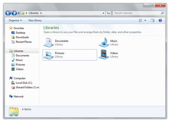
Has the OP even used Explorer? The 'All my files' is done through libraries and has been around for ages. And I'm not sure whether Finder is more visually appealing but it sure is not a great file management tool by any means.
The real question is - what does success look like? If MSFT is able to prove statistically that users are able to perform file operations quicker, find commands that they never knew existed before, would that validate this design?
The biggest difference between All My Files and Libraries is that Libraries requires you to manually manage library paths if the file is not stored in default locations. All files shown up in Libraries still retain the hierarchy layout of original directories.
All My Files just show recently used files (newly added, recently opened) in Spotlight index categorized by kind (not filetype, e.g. all my .py .rb files are grouped in developer category) and they shown up as a flat list without any hierarchy.
I agree that Finder is a bad example, though. (Even though I don't think I need anything more from Lion's Finder.)
If you look at comments Steve Jobs made at one of the All Things D, you know that Apple wants the file system and finder gone from the user experience. It believes the apps should manage this complexity for you. You can see this embodied in iPhoto and iTunes and you see it in how Pages and Numbers now work in Lion
This strikes to the heart of the article. Mentoning finder is a poor example? Finder should only be a fall back most of the files should be automatically connected to an app. It seems such an alien concept that many windows users can not grasp it even after they switch. I think the the windows mobile OS is moving in the same direction but I expect a lot of resistance to implementing it platform wide. The ultimate concern is that windows will spend all their time on marginal improvements to how things are done where they could skip all that hassle entirely like you can with the iPhone and some of the latest Mac apps.
Lion isn't there yet there is a strong argument for just using a tablet. The explorer finder and all the other expectations for what is in an OS just get in the way. Most people just want a gadget that gets things done not sometihingnthey need to root and (re)program.
Windows 3.1 had a pretty awesome file acess system for the time win 2000 nt was the best though clean search with predictable results. That is an aside if you need to extensively use search or curate your files something is suboptimal in tour apps.
This analysis has very little to do with User Research. The analysis is all about a fundamental difference in the approach that Microsoft and Apple take to file management.
Microsoft's solution may not be "elegant" or changing their current paradigm, but a paradigm shift is very difficult, especially when you have to accomodate many legacy users. Microsoft's solution always looked (to me) like a decent incremental solution that would work for the Windows user base. What's wrong with that? It may not be as elegant as it can be, but it's definitely not as ugly as so many are making it out to be. And if it works, what's wrong with that?
The point that (most) users just want to "find their files" and not "explore the filesystem" is a good one. That said I think both Apple and Microsoft have not found the optimal solution but instead seem to be stuck in local maxima.
I actually tend to use the shell for almost all file management tasks. But it seems to me to be an exercise in futility to try and make a file manager app that pleases both users who just "want to find their files" and those who want to be able to organize them in a specific way or for other reasons need more direct visualization of the underlying filesystem.
> That said I think both Apple and Microsoft have not found the optimal solution but instead seem to be stuck in local maxima.
The Finder is not a maxima in any search space. It's always been terrible (where always == since OSX was first released) and it has not significantly improved over time.
As to Windows's explorer, I've find it regressing over time: I have not found 7's explorer to be superior to 2k/XP's under any metric, instead it's more confusing (menubar randomly hiding and showing), it defaults to completely pointless and insane options (Burn as one third of the sparse toolbar? Really?) and the search UI is a severe downgrade from XP's once you get to your results.
> On the upside you have the amazing breadcrumbs...
The only use I've had so far for them was confusing me as to how I could edit the address bar to jump to an arbitrary location. I've yet to use these things at all, although I don't mind them much.
Same as the finder's path bar (or the contextual crumbs menu on finder titles), checked out, never used.
He misses the point entirely. If one wants to do in Windows what he suggests is so integral to Finder one uses the
"recent files" link in the Start menu or any open file dialog. The purpose of the original blog post was to improve what Windows Explorer was designed to do - manage large sets of files and folders.
I think the main problem with Microsoft is that their strategies have been more focused on doing things that reinforce their Windows monopoly. I can understand why, since it's what keeps them alive, but it also forces unnatural behavior, like embedding IE into the OS, and prevent natural innovation, which is what Windows is suffering from currently.
Now their focus appears to be changing things so that people will upgrade their OS. This is also unnatural behavior, because frankly nothing really needs to be changed anymore, except adding more device drivers and making the OS faster. Changing things around for no particular reason will likely annoy a lot of long-time Windows users (like me). They are providing the exact same functionality, but are just moving things around, to give the illusion of change and value.
However, I think one strategy they are doing is that by using the "Ribbon" experience, they are trying to keep newer Windows users from being able to migrate seamlessly to Linux or MacOS. Right now, everything across all the OSes is menu based, so there's little friction in migrating. If a new generation of users are used to the Ribbon, then moving over to Mac or Linux will be "annoying" to them.
So I think the article is misunderstanding Microsoft. Microsoft isn't making changes because they want to improve the user experience. They are trying to change the user experience in order to preserve their desktop monopoly by leveraging their new users and preventing a barrier of entry to other OSes. Which makes sense from their perspective because they have the money to do the research, and they manpower and resources to make these sweeping changes.
>Microsoft isn't making changes because they want to improve the user experience. They are trying to change the user experience in order to preserve their desktop monopoly by leveraging their new users and preventing a barrier of entry to other OSes.
You're looking for a malicious intent in everything Microsoft does. Isn't it possible that the Windows execs simply believe tha the ribbon interface is an improvement rather?
Your idea also just doesn't make much sense. If switching to the ribbon adds a large barrier to entry, then it's also a large enough change to discourage customers from upgrading to Windows 8.
I don't think it's malicious, I think it's self-preservation. It's a fact that their innovation has been strangled because of their strategy to circle the wagons around Windows. Look at what happened once they gave their engineers some breathing space: they created Bing, which is seemingly decent. Also, X-box and especially the Kinnect. Microsoft CAN do innovative things, the only problem is their corporate culture to protect Windows at all costs.
Changing the user experience, to me is a competitive enhancement. Do you think people actually cared about that much about menus that it needed to be changed? It's really doubtful. It's obvious that they are trying to differentiate themselves from the other OS's with it.
Ribbon was the only major new feature added to Office. Again, it's obvious they were doing this in order to give people a reason to upgrade, because Office is now fully-featured, with very little reason to upgrade. I'm still using Office 2003, and I could probably get away with using Office XP or 97.
In terms of discouraging current users, that's why they have the option to remove Ribbon for older customers, but they will default to the new way for new users. I'm still using the Windows 95 interface on Windows 7.
Yes, I use it at work (I use Office 2003 at home). I've grown up on 20 years of Microsoft Word (since Word 2.0 on DOS) so I'm very familiar with the menu system, and I know the features that I need. So Ribbon is annoying for me. I'm sure for new users it's not annoying at all, because it's all they know, and they might find the menu system hard to use.
Hence my point that for new users who tried to migrate to OpenOffice or Google Docs, they would find the menu interface unfamiliar and annoying. I think MacOS is annoying because I can only resize a Window from the bottom right-hand corner, but I'm told they changed that in Lion, which my guess is that it's to appease old farts like me that want to migrate to MacOS. So Apple is doing the reverse, which is to make their OS more palatable (but not completely change) for die-hard Windows users.
I've used Office/OO.o/LibreOffice/WordPerfect for most of my life and had no problem with the ribbon. I've used thousands of interfaces across several OS families, so maybe neither of us has a clue. Bias and anecdata are hard to see past.
Are you sure you're not extrapolating your use case into the audience MS is targeting?
And I'm not sure this is a problem. From my perspective, the ribbon is a huge improvement. Should Microsoft focus on cross-OS metaphors? I want them to focus on improving their product.
There's more shortcuts than ever now. Power users need to realize that the default look should be oriented towards the normal user to make things more discoverable, since power users are the ones than can easily configure things to their liking unlike regular users.
When you're designing an interface for more than 1 billion users, you have to make a lot of trade-offs.
For example, Had they performed a deeper analysis of the motivations and needs of the users, they would most probably have ended up with a completely different solution. They might have had a solution that wouldn’t be held back by assumptions and limitations made in earlier versions of the application.
This article assumes that this is the second version of Windows ever shipped. They assume that this research hasn't taken place at all in the past. That the existing set of functionality hasn't evolved over time. For example the Win7 task bar is the result of this evolution. File managers are a very specific beast though. I get the feeling the author of the blog post doesn't know them very well.
And the author concludes comparing Finder to Explorer. I don't think I'm alone in finding Finder an inferior user experience. And frankly, I think that most users will find the ribbon to be a vast improvement. The mere addition of a more obvious "Open With" button will save me on support calls.