|
> "why use excel at all when the learning curve isn't any easier than learning a few functions in python or R?" It has a GUI. Click on a picture of a pie chart[1] is enormously easier than[2]: from matplotlib import pyplot as plt
# Pie chart, where the slices will be ordered and plotted counter-clockwise:
Aus_Players = 'Smith', 'Finch', 'Warner', 'Lumberchane'
Runs = [42, 32, 18, 24]
explode = (0.1, 0, 0, 0) # it "explode" the 1st slice
fig1, ax1 = plt.subplots()
ax1.pie(Runs, explode=explode, labels=Aus_Players, autopct='%1.1f%%',
shadow=True, startangle=90)
ax1.axis('equal') # Equal aspect ratio ensures that pie is drawn as a circle.
plt.show()
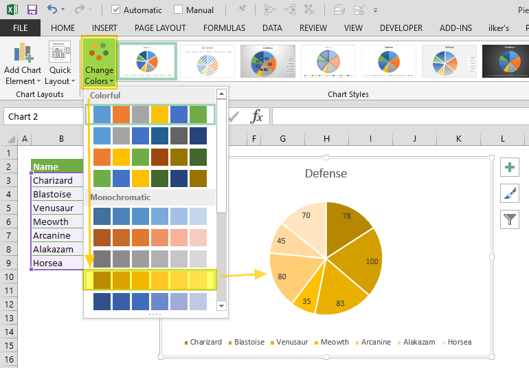
And (clicking a couple of times) includes: no strings, no integers, no method calls, no named parameters, no numeric formating domain-specific-languages, no libraries, no imports, no tuples, no lists, no braces, no parens, no case-sensitivity, no symbols, no text, no writing, no syntax errors, no saving and running cycle, no having to hold the cell order and positions in your head and count through them to get to Runs[2], no trying to get the image out of the show() popup.And includes: previews of the available charts, recommended charts, all the styles of chart work through the same UX without having to care how they are named, they popup Wizard dialogs so you don't have to read in advance what parameters are required and what they mean, in-line editing by clicking and dragging to move and resize the whole thing or almost any part of it, change the chart style without having to rewrite code differently, rewrite e.g. axis labels without having to save/run, choosing colours and styles from visual dropdowns, having the chart redraw dynamically as you change the data in the source cells, works in Excel online, works with multiple people having the spreadsheet open, chart is inline with your data in the same worksheet saved with it. [1] https://www.spreadsheetweb.com/wp-content/uploads/2019/04/pi... [2] https://www.javatpoint.com/how-to-plot-a-graph-in-python |