|
|
|
|
|
|
by vlmutolo
1810 days ago
|
|
|
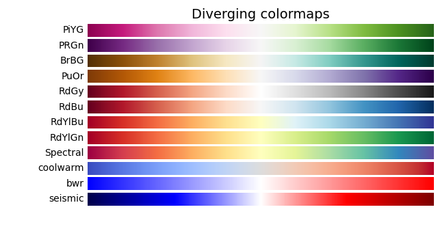
> It is customary when simulating heat flow to use a wacky color palette where red is hot and blue is cold, with all kinds of intermediate colors in between In an otherwise excellent article, this is the only issue I could find. We really need to stop using/recommending/normalizing rainbow color maps (i.e. jet). They actively confuse readers by creating visual artifacts that aren't actually in the data. This article has some great explanations and visuals. https://jakevdp.github.io/blog/2014/10/16/how-bad-is-your-co... The original post uses a rainbow color map to represent temperature-related things because having a diverging color map is often a useful intuition for temperature heat maps. But in that case, we should prefer one of the following diverging color maps listed on the matplotlib site (this list definitely isn't exhaustive, but it is helpful). https://matplotlib.org/stable/_images/sphx_glr_colormaps_004... More on matplotlib's well-chosen color maps: https://matplotlib.org/stable/tutorials/colors/colormaps.htm... |
|
|
For a more technical description the information behind the newer matplotlib defaults, particularly the scipy talk, is great. https://bids.github.io/colormap/
And for those that do not like the matplotlib options, colorcet provides a wider range of alternatives that are not trash (unlike Jet) https://colorcet.holoviz.org/index.html