|
|
|
|
|
|
by stijlist
1934 days ago
|
|
|
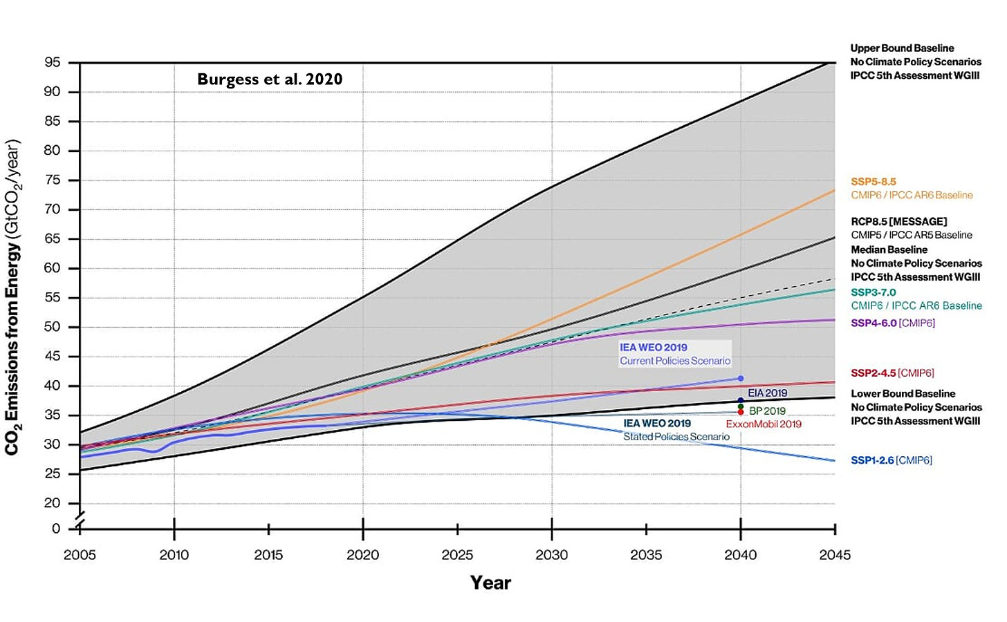
The text says one thing, but the graph they display to support their argument does not say what I thought it said. The purple line is supposed to be our "real" emissions, and the impression you get from the image and text is that our real emissions are much lower than the projected emissions. But if you actually look at the values of the purple line vs the other lines now, in 2020/2021, the values are almost exactly the same. I don't understand how to reconcile that with the text. https://cdn.substack.com/image/fetch/w_1456,c_limit,f_auto,q... |
|
|