Yes, over the 332 days of 2020 on that chart, there are fewer deaths than the 365 days of 2019.
257 average deaths per day in 2020 vs 252 in 2018, which was the previous record high, putting 2020 on pace to become the new high record. That assumes that deaths are evenly distributed throughout the year, which at least in the US, they are not.
An annual snapshot of "excess deaths" lead to bad intuition. A weekly snapshot is much more helpful, leads to more accurate intuition, and generally is preferred.
The second chart is from October, based on the URL, and therefore missed the large spike of deaths in November.
Weekly snapshots are too volatile. If everyone who was going to die in March dies in the first week of March, but none die in the remaining three weeks, this will show a death spike whilst the number of monthly deaths is unchanged. If someone at the end of their natural lifespan dies a few weeks earlier or later than usual, this is not a national concern.
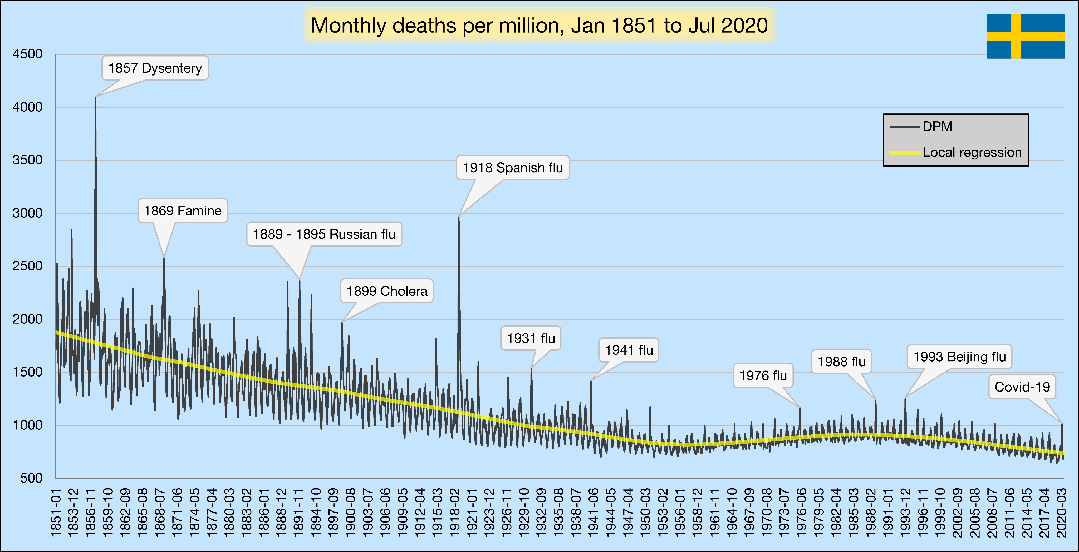
2019 was a weak flu season.
We need to examine this data across broader time scales to avoid the hysteria we are currently experiencing.
“But... what about countries such as the US and Brazil, where far more people have died of COVID than of any recent influenza? Less than 10,000 Brazilians die of the flu each year compared to 180,000 covid deaths.”
Everybody believes there are no restrictions at all and people carry on with their lives just like did before. Nobody talks about group gathering limits (smaller size than in most countries), that restaurants service hot food with much better safety than here in the States, etc. People still believe that Sweden's strategy is herd immunity without any interventions!
257 average deaths per day in 2020 vs 252 in 2018, which was the previous record high, putting 2020 on pace to become the new high record. That assumes that deaths are evenly distributed throughout the year, which at least in the US, they are not.
An annual snapshot of "excess deaths" lead to bad intuition. A weekly snapshot is much more helpful, leads to more accurate intuition, and generally is preferred.
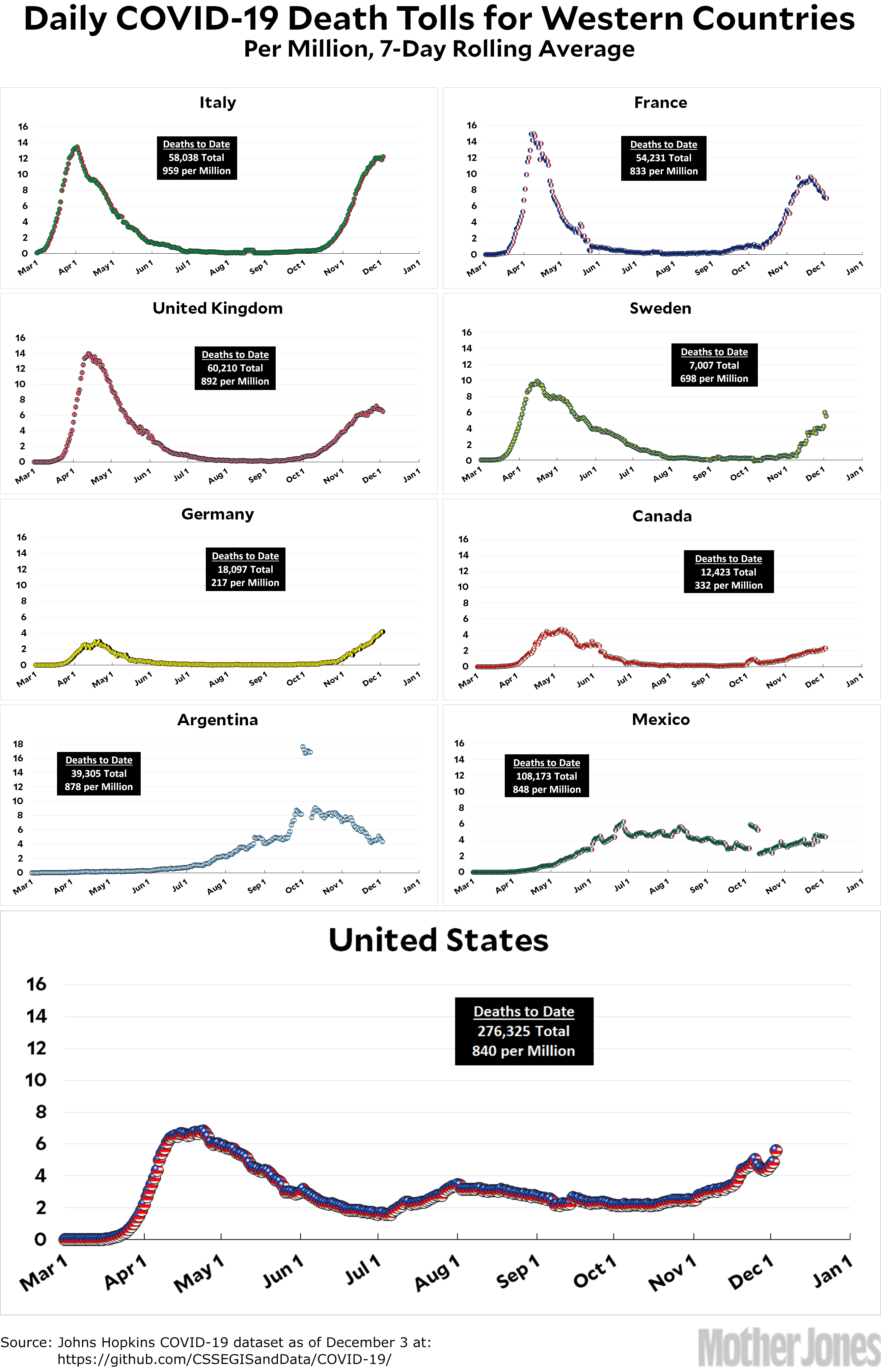
The second chart is from October, based on the URL, and therefore missed the large spike of deaths in November.
Incomplete data leads to bad analysis.