|
|
|
|
|
|
by cs702
2054 days ago
|
|
|
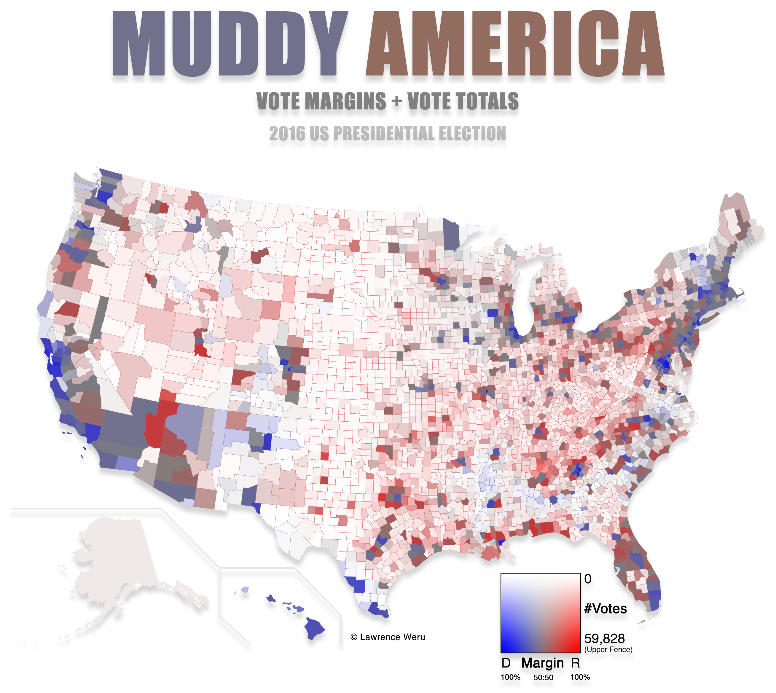
Fantastic work. The final map for the US election in 2016 is both the most accurate and the easiest to understand I've seen so far: https://stemlounge.com/content/images/2019/10/muddy_america_... In this map, saturation and lightness indicate vote density and color indicates the winning party, in each county. IMHO, this is the kind of map that should be used by every media outlet to show election results. |
|
|
I don't believe there is a Grand Unified Theory of Election Maps. Use different maps to convey different facets of information.