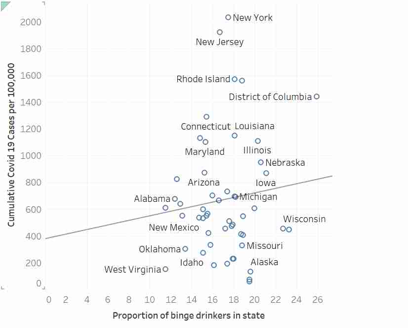
Agreed. I was curious enough to run the model myself so I used a tool to extract the data. The slope estimate (b=17.24) is not significantly different from zero, p=.437.
In case anyone is interested, below is R code to read these data and compute the regression. The summary() reveals the p value for the slope to be 0.437, and that for the intercept to be 0.32.
    d <- read.table("https://pastebin.com/raw/HhWTKZRb", header=TRUE)
    m <- lm(cumulative_covid19_per100000~proportion_binge_drinkers, data=d)
    summary(m)
The problem is that the author is essentially claiming that running the regression for data not passing his eyeball test is, in itself, a misuse of regression...which is nonsense.
I'm not sure I understand your point. Did you actually look at the regression line through the data? It looks crazy off. I'm not a statistician but that line looks like it doesn't represent that data very well at all. People area also saying nuanced comments above but the underlying fact seems to be that this is not a good use of linear regression, and there is no strong correlation between the two axes.
Without access to the residuals, I'd still venture to guess that the assumptions of the regression are not severely violated in this data set.
When this regression is conducted, the null hypothesis is not rejected (regression slope not significantly different than zero). If someone is somehow arguing this regression rejects the null hypothesis, then they would be incorrect. But there is nothing wrong with using regression here. Its kind of the whole point. This is basic regression statistics 101.
Error bands on the regression slope would help people understand the uncertainty of the apparent slope.
Eyeball tests are often misleading, or fail to detect weak correlations (or deviations from model assumptions such as heteroskedasticity). That's why we check with more formal methods.
What are some examples of data sets with high(ish) r with high p (low confidence), and low p (high confidence) with low r?
I guess it would be a very tall, "sharp cornered" parallelogram of data points (clear slope at the average, but high error variation), vs a very short, wide rectangle?