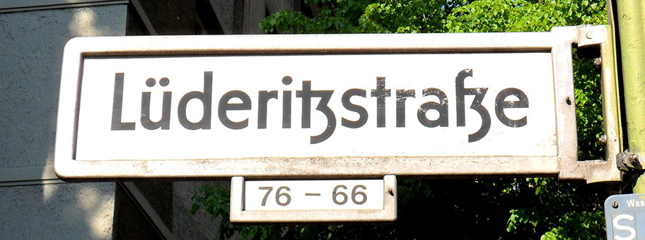
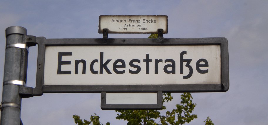
I absolutely love the typographical choices used for Berlin's street signs. There are multiple variants but I'm talking about the posted one. It also preserves the old tz-ligature[0], the vertical descender on lower-case Y[1], as well as both the ch- and the ck-ligature which (being an antiqua font) are mostly realized in terms of careful kerning [2, 3, 4].
The font is both pleasing, readable, breathable, and has these nods to Germanic typographical heritage. It's really lovely. Among my favorite details pertaining to living in Berlin.