Hacker News new | ask | show | jobs
by kire456 2442 days ago
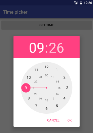
I really don't get the time picker design that basically works as two long comboboxes side by side. Especially the minute picker requires far too much scrolling/swiping for what it's worth.

I much prefer the Android dialog, with a clock face that allows me to select the right time with two clicks [1]. Am I alone in this, and is it hated by all and thus ignored in other OSes? Is it patented and thus unavailable for anyone but Google? I don't get it.

[1] https://en.proft.me/media/android/android_time_picker_dialog...

1 comments

I'm fairly sure even Android has abandoned this type of time picker
It doesn't have two rings anymore, you choose the hours and then it changes the ring to minutes for you to choose that. Functionally the same I would say, for all but the most pedantic person.

And I believe it has been that way for several years...I don't recall ever seeing hours and minutes rings visible at the same time.

Well, no, that is still the current time picker. I find it the fastest and easiest way if picking a time on a touchscreen. Not sure if it would work as well with a mouse, though. And it takes a lot of space.