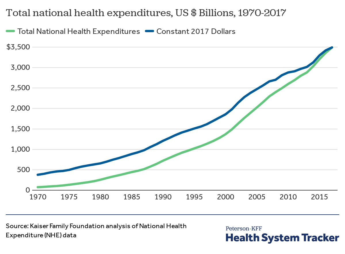
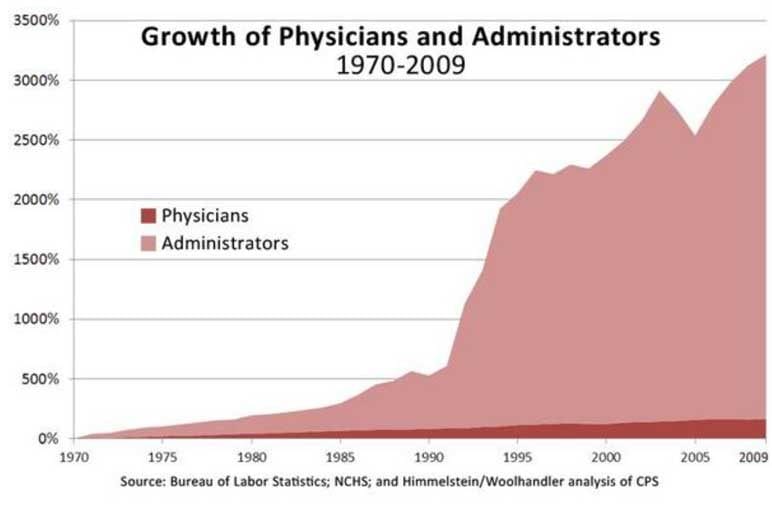
Total health expenditures have skyrocketed[1] along with the amount of hospital administrators[2] over the last few decades. This particular hospital is unlikely to have escaped the trend.
Uncheck the "latest data available" box to activate the range sliders and get a graph of costs over time.
Two things stand out in the graphs:
1. US is more expensive over the whole range of the data (1970 to 2018).
2. They are all going up, mostly at roughly comparable rates. I just looked at the G7 countries above, but the same holds for most OECD countries. It looks like the US has averaged going up a little more than many of the rest, but it looks like nearly everybody has got a problem in this area.
Event if the relative increases were the same, the absolute costs are on a different basis. US health expenditures per capita is double the average EU nation.
You have no idea. I work a small community hospital and we have 9 VP's and 44 Directors. One department has 9 employees and 2 Directors.