I used to work on near Earth satellites that had a <15 minute contact window about 10 times per day. Sensor requests and aiming commands would get pre planned about 2 days out with a gui that would let you point and click and it would package the proper commands automatically. Usually a team of ~2 analysts would work together to make sure all of the requests would make it into the upload package but always with a gui.
We could also get a short notice request for data and could speed through the process in about 2 hours. Still just with a gui. The manual commands would never get sent ftp style because we only had short windows of contact because the dishes on Earth would only have the craft in the sky above them for so long.
Some satellites pay for time on a set of air Force satellites in Geo called TDRSS to give them continuous comms but those are really expensive and really slow compared to what you can downlink to the ground.
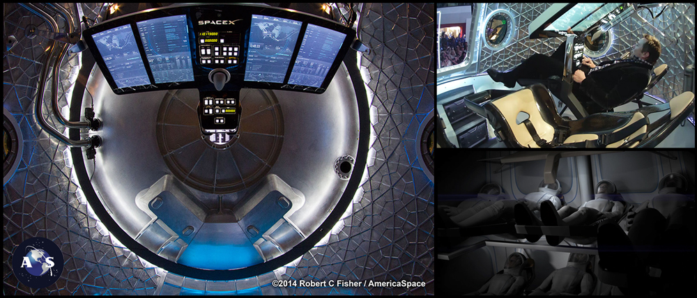
Wow, I looked at it and was just about to come back here and bash non-functional science fiction design, but it's actually completely usable and every element is displaying relevant data.
Cool looking, but I hope the real capsule's UI looks absolutely nothing like that, judging from the stories I've heard of the Model 3's touchscreen locking up and needing to reboot mid-drive fairly frequently. Not everything ought to be a touchscreen.
But now I wonder what a working UX looks like that sends commands to such very remote spacecrafts.
Do they have a review process, a checklist? Does one person just type some stuff and a file gets uploaded (like a cosmic ftp command)?