|
|
|
|
|
|
by corysama
5693 days ago
|
|
|
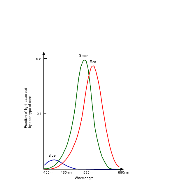
I do know a little about human color perception. Although the author's example is flawed, his argument does stand. Human eyes are much less sensitive to details in blue compared to green and red. Here's the best illustration I can find in a minute's googling: http://homepages.inf.ed.ac.uk/rbf/CVonline/LOCAL_COPIES/OWEN... from http://homepages.inf.ed.ac.uk/rbf/CVonline/LOCAL_COPIES/OWEN... This shows up in the Red-vs-Blue battle analytics in both Halo and Team Fortress 2 --Blue wins measurably more often because they are harder to focus on. Red-vs-Green would be more fair, but that would screw over the large male population with Red-Green colorblindness. This is why the standard conversion of linear RGB to greyscale is 30%red + 59%green + 11%blue. 33% each would make the blue seem to have too much influence after conversion. This is why BluBlocker glasses make the world seem more sharp. It's why I try to minimize blue in my IDE color schemes. If you are designing a purely pragmatic UX that requires seeing fine details, I'd recommend a yellow-on-black color scheme with some green and little blue. The classic green/amber terminal screens of yore were ugly, but effective. |
|
|
IIRC our strength with green is why many night-vision systems use only green. It has other benefits such as not killing your night vision, but when you take the darkness of the night and remove the red and blue components, you can see better. Once again, IIRC.