|
|
|
|
|
|
by red_admiral
2956 days ago
|
|
|
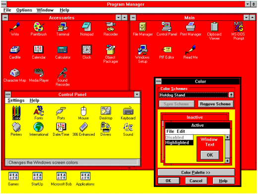
Some things I like about the classic style: * The title bar of the active window is shaded in the accent colour, those of inactive windows are not. This makes it clear at a glance which window I'm typing into.
* Unless a developer goes out of their way to mess with components, a button always looks like a button and things that look like buttons are always buttons.
* In the control panel, you can *easily* customise the fonts and colours for things (like picking your own colours for both active and inactive title bars). Yes you can make completely horrible setups this way, or set your co-worker's PC to comic sans as a joke, but someone with dyslexia, colour blindness or other disabilities can also easily set the UI to exactly what works for them. "Themes" in later versions are both less flexible and require someone with more time and technical skills to create them in the first place.
Along similar lines, I would take the old GNOME 2 "here's a set of dropdown boxes for accent colours 1-4" over GNOME 3s "here's 1000 lines of CSS, good luck with that" approach any day. |
|
|
The lack of that was one of the most baffling things about the Win10 UI --- especially when you read about what they did:
https://www.howtogeek.com/222831/how-to-get-colored-window-t...
Microsoft chose to force white title bars in an odd way. In the uDWM.dll theme file in Windows, there’s code that looks at the current theme file name and compares it to “aero.msstyles” — the default theme file. If it matches, Windows ignores the color specified in the theme file and sets the color to white.
Someone at MS thought it would be a good idea to deliberately break title bar colouring by checking for a hardcoded theme filename. It wasn't a bug, it was an active decision to do such a "hack", and presumably others who reviewed the code were completely fine with it. Besides the completely stupid decision to force titlebars to be uncoloured, it's well deserving of a WTF!?