Hacker News new | ask | show | jobs
by tinokid 3028 days ago
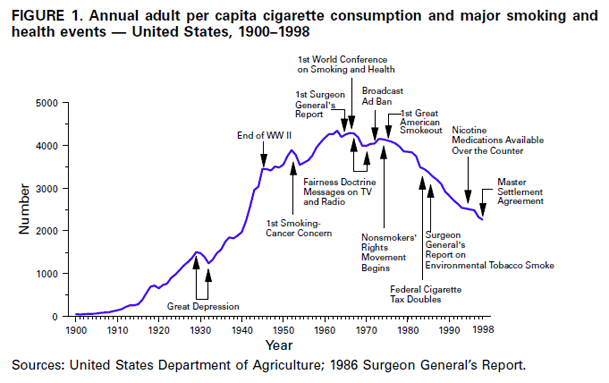
> Even beyond that the absolute rate of cancer deaths in the US peaked in 1990 216 per 100k vs 2015 at 158 per 100k. Which is a massive drop even over 1950's pre screening and younger population numbers of 193 per 100k.

Hmmm... Apply a 25 year lag. https://www.cdc.gov/mmwr/preview/mmwrhtml/figures/m4843a2f1....

>PS: Stomach cancer is flat out much less common because we understand a major cause now. Cervical cancer rates will similarly drop from the HPV vaccine.

Yes...lots of progress in infectious disease treatment, very little with cancer treatment.

1 comments

Lung cancer has not changed overall numbers all that much from 1990. https://seer.cancer.gov/statfacts/html/lungb.html So, no it's not responsible for the massive drop in cancer deaths by age group.

I included HPV and Stomach cancer in a PS specifically because they are minor changes to overall numbers. Sunscreen also impacts the rates people get cancer, but it's a very minor effect.

"Not all that much" is not how I would describe a chart like this: http://www.clevelandclinicmeded.com/medicalpubs/diseasemanag...

And lung cancer is not the only cancer caused by smoking.

In any case, cancer death rates and changes in risk factors do not speak directly to the claim about treatment effectiveness. If you are diagnosed with cancer, you are basically every bit as f'ed today as you were 50 years ago, except in the special case that your cancer happens to be one of those that never would have been noticed back then.

Notice that Male at the bottom of the cart women are only down 17%. That makes the impact on overall numbers significantly lower. It's also a chart of deaths, what you want to support the idea that treatment is useless is a chart of new cases.

Also, see that huge drop in Prostate and Colorectum cancer. Yea, that has nothing to do with smoking it's almost completely related to better treatment making a huge difference.

And again, we are not looking at equivalent populations. The older the US population the worse cancer numbers look in absolute terms.

So, even the chart you are using to support your argument actually supports mine.

PS: To account for a 25% drop in cancer deaths lung cancers could have hit zero in that cart and it would still not be enough.