| > “monospace fonts tend to be wider, so the default font size (medium) is scaled so that they have similar widths” > “the base size depends on the font family and the language … Default system fonts are often really ugly for non-Latin- using scripts.” ‘often’, ‘tend to be’: I am worried. I think it’s a really bad idea to deflect default behavior based on such assumptions, certainly when the deviations are a blind process triggered by proxies (like language tags and some vaguely statistical rules-of-thumb for dealing with generic font family names). That is: without even looking at the actual design and metrics of the actual font involved.¹ What happens if the monospaced font in case has a normal x-height and/or an advance-width equal to that of its serif counterpart? What if the CJK and Devanagari fonts have characters drawn already ‘big on the body’?² Then such hard-coded default moonshot-fixes which try to cater for the lowest common denominator will make things needlessly hard to debug and force the designer still to ad-hoc size-adjust font per font, but now also trying to fix the browser’s ‘fixes’. (Too bad: any `normalize.css` wont help…³) And yet, all of the needed data is available in the font file. There’s even a dedicated CSS property for dealing with fonts’ varying metrics: `font-size-adjust`.⁴ Not that browser makers care to implement⁵, but since the OP’s post concerns Firefox (which does support `font-size-adjust`, but the article does not discuss it) I wonder: is it a matter of performance that retrieving the actual font metadata and metrics is left out of the equation? Surely, the fact that local font files, base64 data-URI embedded or externally hosted ones can be used, makes implementation all but trivial… At Textus.io⁶ we’re going great lengths to solve typographic issues such as these. Point in case: for each font we read out the `xHeight` value, then calculate the actual font-size relative to the font’s UPM (unitsPerEm), so we have consistent apparent font-sizes, c.q. aspect ratios. I think it all boils down to a separation of concerns: proportion and interrelated sizes (ascender, caps, descender, x heights, stem width, etc.) are up to the discretion of the font designer, overall aspect size is the business of the typesetter (css stylesheet author), and the browser ought always draw consistently, regardless of generic font family name, language and/or Unicode code range. ¹ https://opentype.js.org/font-inspector.html
² https://medium.com/@xtianmiller/your-body-text-is-too-small-...
³ https://github.com/h5bp/html5-boilerplate/issues/724
⁴ https://developer.mozilla.org/en/docs/Web/CSS/font-size-adju...
⁵ http://caniuse.com/#feat=font-size-adjust
⁶ http://www.textus.io |
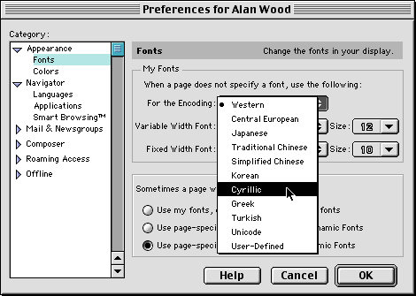
It has worked this way since the days of Netscape Navigator[1], though, so it's not a change or a new idea. It's just keeping things the way they've always been. (Nowadays, in Firefox, the corresponding settings are under Preferences -> Content -> Fonts & Colors -> Advanced.)
[1] http://www.alanwood.net/unicode/mac_net6.gif