He could have asked a graphic designer. Those screenshots aren't "as small as possible" - they're as large as possible! You've given this poor designer a 256x240 pixel image and asked him to "make it look good" in a full page print ad. Even at a less than ideal 150ppi, that screenshot is going to be less than two inches wide. Now you have 90% of a full page ad to fill up, so what follows is pretty natural.
(I bet there was some Frogger marketing guy who kept insisting, "can't you make the screenshot just a little bit bigger?" And the hand-drawn mock screenshot was the eventual compromise to make him shut up.)
I had to know more so I looked up how they made those screenshot maps in Nintendo Power:
"That machine that we had at Work House in Tokyo looked like a VCR or something. It was huge. They'd hook it up to the game system, and then it would print out a picture that was maybe four postage stamps big. It wasn't even as large as a Polaroid. It would print out this beautiful color picture, and then these guys would sit there and take their X-Acto knives and cut out the trim, and then they'd paste them onto this larger board, and make this huge board that was the entire map."
Fascinating! The resolution (meaning literal detail per square inch, in this case) of the artwork is still terrible and you probably don't want to show off individual pixels, but at least you could use a proper print resolution and blow things up to at least 3-4 inches wide on the page if you wanted to. I appreciate how these photos are able to capture the intended phosphorescent blur as opposed to the jagged source pixels that a raw screenshot of today would produce.
I always wondered about this and would love to know more about it. Back in the 80s when I used to read the ZX Spectrum games mags in the UK, one magazine ("Your Spectrum") always had crisper screenshots than any of the others, clearer than seemed possible to me using a camera pointed at a TV screen. I always wondered what they did and what the difference was.
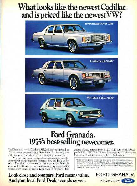
What is that format/style called? I remember reading all the late 70's to early 80's magazines in my our basement as a kid, and all the ads had that look to them. Take for example this Ford ad for a car:
The style kind of goes, big headline, then 2-4 fairly detailed paragraphs about the product. You never see that any more. The video games always followed the same template:
CAN YOU HANDLE THE ACTION
Are you ready for craziest alien battles on the Frobozz Computer System? Then play Foobar 2000, the ultimate adventure! You'll face dastardly demons and high speed challenges, sure to make you ask for more!
I find it quite delightful to look at these advertisements having binged Mad Men for the first time a couple of weeks ago. Cool to see that car news advertisements haven't changed their format in over 60 years. One can almost literally place the ad on a website such as top gear and it'd blend in just fine.
It seems like it's still ongoing. TV ads for mobile games, especially, seem to avoid showing actual gameplay for more than a tiny part of the ad. A lot of them stick to fancy CG and actors.
(I bet there was some Frogger marketing guy who kept insisting, "can't you make the screenshot just a little bit bigger?" And the hand-drawn mock screenshot was the eventual compromise to make him shut up.)