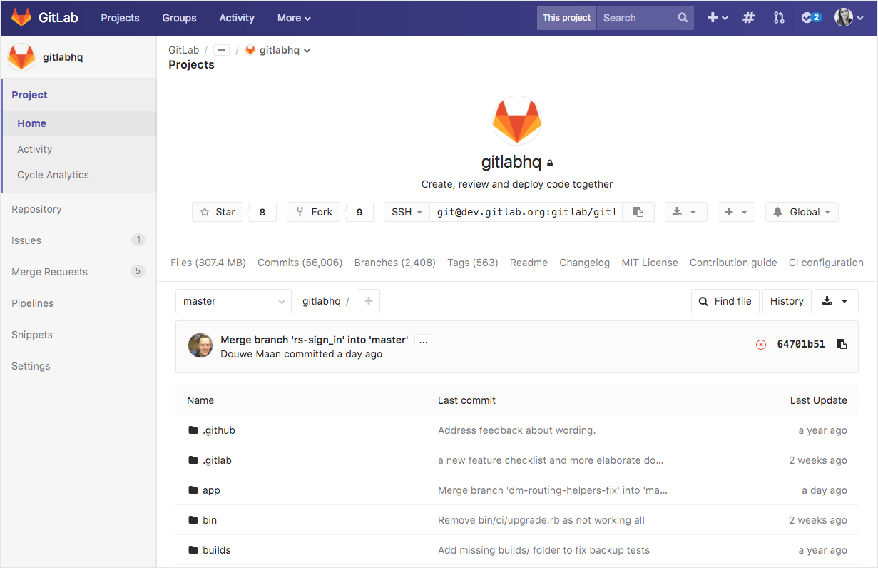
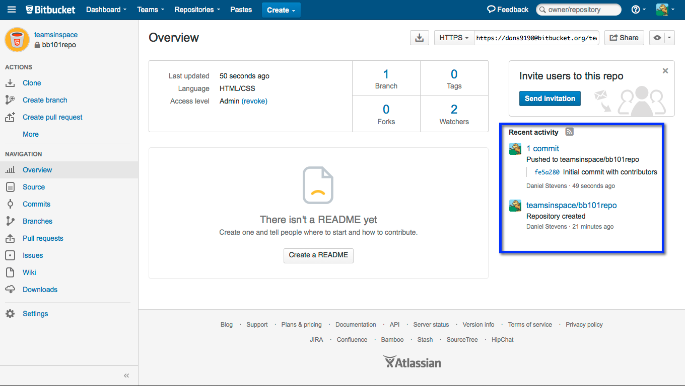
In practice, it comes across as something of a hybrid of Github and Bitbucket's UI-- the top gobal navigation bar and sidebar navigation structure are very similar to Bitbucket's, but they take Github's "code first" approach to displaying repositories (the first thing you see when opening a repository in Gitlab or Github is the source tree; on Bitbucket the first thing you see is the readme and a summary of bug reports).
It's probably also worth mentioning that Bitbucket's also in the process of a massive navigation redesign; the "new" Bitbucket eliminates the top global navigation bar, moving some of its elements to a new sidebar (beside the context-specific sidebar) and eliminating much of the global navigation elements completely from repository pages (want to go directly from a repository page to a team or project page? You can't unless it happens to be in the repository's breadcrumb bar.). This is about as much of an improvement as it sounds like.
(Sorry, no screenshots of the new Bitbucket UI since I can't quickly produce one that doesn't have private info in it.)
" the top gobal navigation bar and sidebar navigation structure are very similar to Bitbucket's, but they take Github's "code first" approach to displaying repositories (the first thing you see when opening a repository in Gitlab or Github is the source tree; on Bitbucket the first thing you see is the readme and a summary of bug reports)."
Thanks for the feedback! Glad you spotted the differences between BitBucket's Design and our own. While we would love to design with a blank slate, we are not. Our users arrive with expectations and deeply implanted ideas of how things should look, feel, and behave. We have to temper exploration with practicality. The downside of that can be that the UI has a similar appearance to other platforms.
Apart from a basic 3-parts layout, I can't spot too many differences. BB is organised around actions first (actions in the menu, big "create" buttons, etc. even the access level has easily reachable "revoke" for some reason), GL is more about notifications and exploring. (shows the files instead of "you didn't create README" by default) The layout they put it in seems like the least interesting bit to me.
It's probably also worth mentioning that Bitbucket's also in the process of a massive navigation redesign; the "new" Bitbucket eliminates the top global navigation bar, moving some of its elements to a new sidebar (beside the context-specific sidebar) and eliminating much of the global navigation elements completely from repository pages (want to go directly from a repository page to a team or project page? You can't unless it happens to be in the repository's breadcrumb bar.). This is about as much of an improvement as it sounds like.
(Sorry, no screenshots of the new Bitbucket UI since I can't quickly produce one that doesn't have private info in it.)