Hacker News new | ask | show | jobs
by ocdtrekkie 3463 days ago
The ribbon was the UI change that got the most people upset, but in retrospect, I feel it was complaint for complaint's sake. Once you learned to use it, I'd argue the ribbon is a vastly superior UI. While it is less customizable, and very obscure features can be harder to find, the most common features are better arranged, better presented, and more usable. There are some changes I dislike in newer versions of Office since, but I wonder how I'll feel about them down the line too.
5 comments

I like the ribbon pretty well, although it was clearly designed in the days of 4:3 displays. Would be nice to have an option to put it on the side instead.

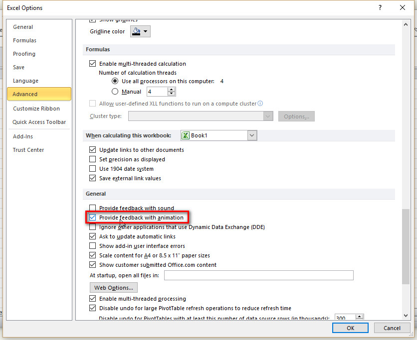
The one thing I really dislike in Office 2013/2016 is the animated cursor. In Word it's just a distraction, but in Excel it is ludicrous: when I click on a cell, I'm looking at that cell, I'm not thinking about the cell the cursor used to be on at all, but for some reason Excel wants to draw my attention back to the previous cell just so I can watch the cursor box move. This is not something to benefit the user, it's a designer screaming "Look at me!"

Fortunately, there is a way to turn off these Office animations and a lot of other animations too. Open the Ease of Access Center in the Windows control panel and select "Make the computer easier to see". There's an option there to "Turn off all unnecessary animations".

This stops the animated cursor and some other animations in Office, and it also turns off the goofy Start menu animation. To my eyes it is a nice improvement.

> although it was clearly designed in the days of 4:3 displays. Would be nice to have an option to put it on the side instead.

I just double-click a menu item to collapse the entire bar, which ends up using the same space as an old school File menu would. Then I tap `Alt` to bring up the shortcut letters and tap them to activate features. It's incredibly fast and essentially modal. Gives me a good Vimy feel.

Office 2013 and newer also has a full-screen mode which hides all the menus and lots of chrome, giving you mostly data. It's the only way to use Outlook and Excel with maximum screen efficiency.

Nice tips, thank you!
> I like the ribbon pretty well, although it was clearly designed in the days of 4:3 displays.

This. The only reason I fire up any Office app these days is if something I'm doing has gone horribly wrong (as in, causing an Office app to be the best tool for the job) but if the ribbon was down the side of the screen instead of the top, I wouldn't be nearly so mad at it.

Ribbon is brilliant. When nicely designed and really needed (in certain applications and only them!) it is the most important GUI evolution of the last years.
I liked the ribbon once they added the search box, at which point you could mostly ignore the confusing and inconsistent layout of options and just treat the thing as a giant garish version of Emacs.
As an intermittent Word user, I've never learned the ribbon.

I could see how you could conclude that your complaining was for complaint's sake, but mine?

I think he would probably say "I don't like it because I haven't taken any time to learn it" is complaining for complaining's sake.
I guess that means most of the complaints against vim & latex are then complaining for complaining's sake. (Not necessarily disagreeing, though...)
Huh. As a software professional I stopped blaming the user for that a looong time ago.
That's a learned disability in our industry, coming from the mindset of maximizing short-term business goals (like "paying user is always right" or "more 'intuitive' UI -> more people will like it initially -> more growth -> more $$$"). Vim and LaTeX were primarily made to be efficient tools, and thus don't shy away from requiring users to utilize the long forgotten skill of sitting on their butts and learning for goddamn 5 minutes, to the clock.

Our industry-standard reasoning is good when all you make is cheap shiny toys that need to get popular quick to attract investor money. Much less so if you want to design software that empowers its users to do more.

EDIT: Vim/LaTeX mention borrowed from parallel comment of 'beefield.

I know that Emacs and LaTeX both have newcomer-friendly tutorials, that's how I learned them initially. In Vim, I only know about 5 commands, that's enough to get simple edits done when emacs is not installed. So I don't rate any of these as poor for new users, as long as the new users can find the tutorial.

Let me give you an example of a complicated product where the user-interface can be made friendlier. I worked on a C/C++/Fortran compiler (PathScale) for a while. Users would compile non-standard-conforming programs, get the wrong answer, and then tell us that we had a bug in our compiler. I got the compiler guys to add some compilation flags for things like "use C argument aliasing rules in Fortran". Then when a user reported this class of bug, we had a section of the manual which said: "Compile with these flags. If you now see the correct answer, figure out which flag fixed your program, and then go read the appropriate paragraph in the manual explaining how your program is not standard-conforming." It worked great for both our in-house customer support people (who used it all the time) and customers (who might use it once or twice, usually after being prompted by our customer service people.)

Interestingly, Word on MacOS has both the ribbon and the old menu interface