Hacker News new | ask | show | jobs
by kailuowang 3546 days ago
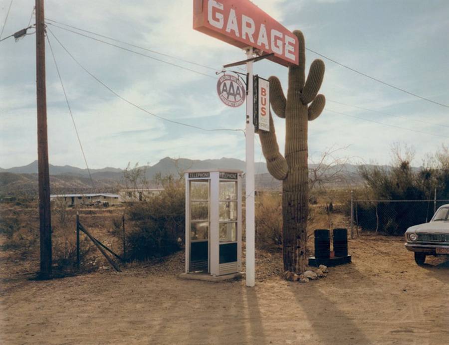
Posted a masterpiece by Stephen Shore, Keegan didn't care for it.

Static composition, my eyes don't really know where to look and the pic is not very exciting… It's flawed, but you'll get there: keep working on your composition and lighting. This is at most 3.8/10. #messy#boring

Here is the photo http://www.fubiz.net/wp-content/uploads/2015/07/stephenshore...

2 comments

I mean, is that a masterpiece? I ask as someone who is unaware of Stephen Shore and has never seen this picture before. As someone living in 2016, that looks like a random picture of a gas station someone took on a road trip. I agree with Keegan here, it's boring.

I'm sure there's some historical context or something I'm missing out on here, but that's just my take looking at the picture.

Stephen Shore is one of my favourites. It might help to think of this image as representative of a body of work, which makes it legible. (and, let's not forget, financially valuable). It's not the greatest Shore image.

Shore has a good "eye", which is something subjective that needs training to develop and recognize. It's very plausible that the particularity of a given artist's "eye" will be quantifiable by AI systems soon.

Shore wrote a popular book called "The Nature of Photographs". Recommended.

I am also unaware of Stephen Shore, and have not seen this picture before. I guess we can chalk it up to different tastes - I think this picture is amazing. It captures the feeling of the place.
How do you know what the feeling of the place is? Have you ever been to that gas station?
It doesn't matter, the point is that a feeling is captured.

Many people seem to think that photography is solely documentary, but that is only one possible aspect. You also have control over what is in and out of the picture, where objects are relative to each other, the relative tones and brightness of objects, etc., and can use that to tell a story that's not strictly true. If you've ever been composing a shot, noticed that there is a big pile of garbage in the frame, and shifted the angle slightly, you're already doing this.

Well...a feeling is captured, not the feeling.
Like all forms of art, the idea is to show the artist's feeling, not to tell you what you would personally feel.
I have a DSLR and several fairly good lenses and like taking pictures, but I'm by all accounts a layman, and seeing as I'm unfamiliar with that photo, obviously not well versed in the industry.

But honest question: Is that a good picture? I don't assume that the AI is trained enough to give accurate critique on all photos, but in this case I might agree with it.

I'm not trolling nor mean any offense, but is there quantifiable skill behind that photo, or is it just as subjective as painted art? A simple example would be a Pollock painting which I don't care for at all.

Art MA holder here: Pollock is a really good example of the hard-to-pin-down quality of optical balance or energy or "eye". It's a learned thing like most aspects of culture. There are personal variations in "eye" judgement but enough consensus to keep the art market afloat. It does also have something to do with hierarchical structure, fractals etc., especially in Pollock's structurally simple drop paintings. His idea was a conceptual innovation but now does look pretty boring.

You might also dislike Pollock not only for being boring but for being associated with a tedious CIA-sponsored moment in art in the 50s, in which case I applaud you.