The first time I heard about this was last week when I was listening to the economic issues that the article mentions on NRK "political quarter" (NRK is the national broadcaster) with the word "waste" being thrown around a lot. This article from VG debates the cost and puts it into contrast what could have been done instead: https://www.vg.no/nyheter/i/q6k3ko/skipstunnelen-er-historis... ... it's been contentious as I understand.
Most of the Norway's Western coast (basically the extent of the country) is mountainous so building infrastructure there inevitably involves blasting the rock. At the same time the country is huge, bigger than Germany or the UK. So naturally a lot of tunnels.
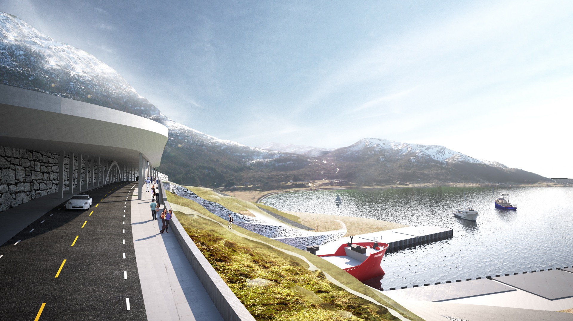
This one a bit special: most of the boat traffic through it are meant to be ferries so it is to be commissioned and managed by the National Road Authority. At the same time it's quite unique if only due to enormous cross-section and can't share many usual national design solutions for the tunnels. For instance my company was asked a quotation for a PA system for it and it's really a challenge. So it's no wonder that it's delayed so much: it requires a lot of bespoke solutions.
When an architecture company seemingly uses AI to render mockups, they really need to ensure consistency and accuracy. It's not that difficult nowadays. It was quite confusing trying to understand the differences in design between pictures and to compute why the tunnel seems so short compared to the mountain, until I realized it must have been laziness; not laziness because they are using AI, but laziness to do their job right.
I can't see TFA due to cloudflare, but there is a unique image style used in a lot of architectural mockups of proposed buildings and things that also looks very strange and uncanny. I can't find any examples of it online right now unfortunately, but could that be what they're doing?
I suspect quickly slapped together 3d renders photoshopped into actual landscape images. With very limited attention to detail when it comes to matching perspective or lighting between render and photo, or when it comes to blending them together
There are more images like [1] that are just the cheap 3d renders, with less of the photoshop butchery
I don't see anything in those visualizations that makes me think AI. Its completely run-of-the-mill architect visualizations that have always been atrocious.
It's the main lane where all coastal traffic passes, and one of the most dangerous and weather sensitive regions on the lane. Larger ships sail farther out when weather conditions don't allow for sailing the coast, but a lot of traffic including fishing vessels carrying fresh fish simply have to wait. So it's not as meaningless as geography makes it look.
> The Stad Ship Tunnel (Norwegian: Stad skipstunnel) is a planned canal and tunnel to bypass the Stad peninsula in Stad Municipality in Vestland county, Norway. The peninsula is one of the most exposed areas on the coast, without any outlying islands to protect it from the weather. The section has traditionally been one of the most dangerous along the coast of Norway.
> The surrounding waters, known as the Stadhavet Sea, is the most windswept part of the nation's coastline and is stormy around 100 days of the year, leading to ships often waiting days to pass through.[6][7] Currents, created by the area marking the meeting point of the North Sea and the Norwegian Sea further complicate navigation: Since World War Two ended, 33 deaths have occurred in maritime accidents within the Stadhavet Sea.[5] The official Visit Norway website has claimed Vikings would drag their boats over the peninsula to avoid crossing the dangerous patch of sea.