For me, this is step backwards, because it breaks existing UI paradigms.
Why is it a good thing for the preferences pane have to appear in a different place from where it does in every single other application on my OS?
And this deliberately confuses application content versus Internet content. Do you have to scroll down to click "OK"? What if it isn't visible? Or should it be labelled "save"? Why learn a new dialog-style interface? And why on Earth does this need to be a tab -- are people going to be tabbing between their stock quotes, news, and browser Preferences tab?
I dunno... people still use word-processors, spreadsheets, sometimes e-mail clients...
For me, this still makes as much sense as Excel opening up its preferences as a new spreadsheet, or a 3D rendering program asking you to edit a 3D wireframe to change options. Content is content, application is application -- I don't understand why confusing the two could ever be a good thing.
While there is room for innovation with web-based UIs, they are just really inconsistent. In fact Firefox sticks out like a sore thumb compared to other apps on my OS. And I find it a real annoyance. That's why there is a niche for a browser like Camino, that feels more native than Firefox on OSX.
When I use MS Windows I really notice this, installers, application control panels, window titles and controls - seem to be all over the place. It's a minefield. Linux desktop suffers this too with different GUI toolkits - QT, GTK etc. There's a part of you that just adapts and gets used to it. But ultimately it's a pain.
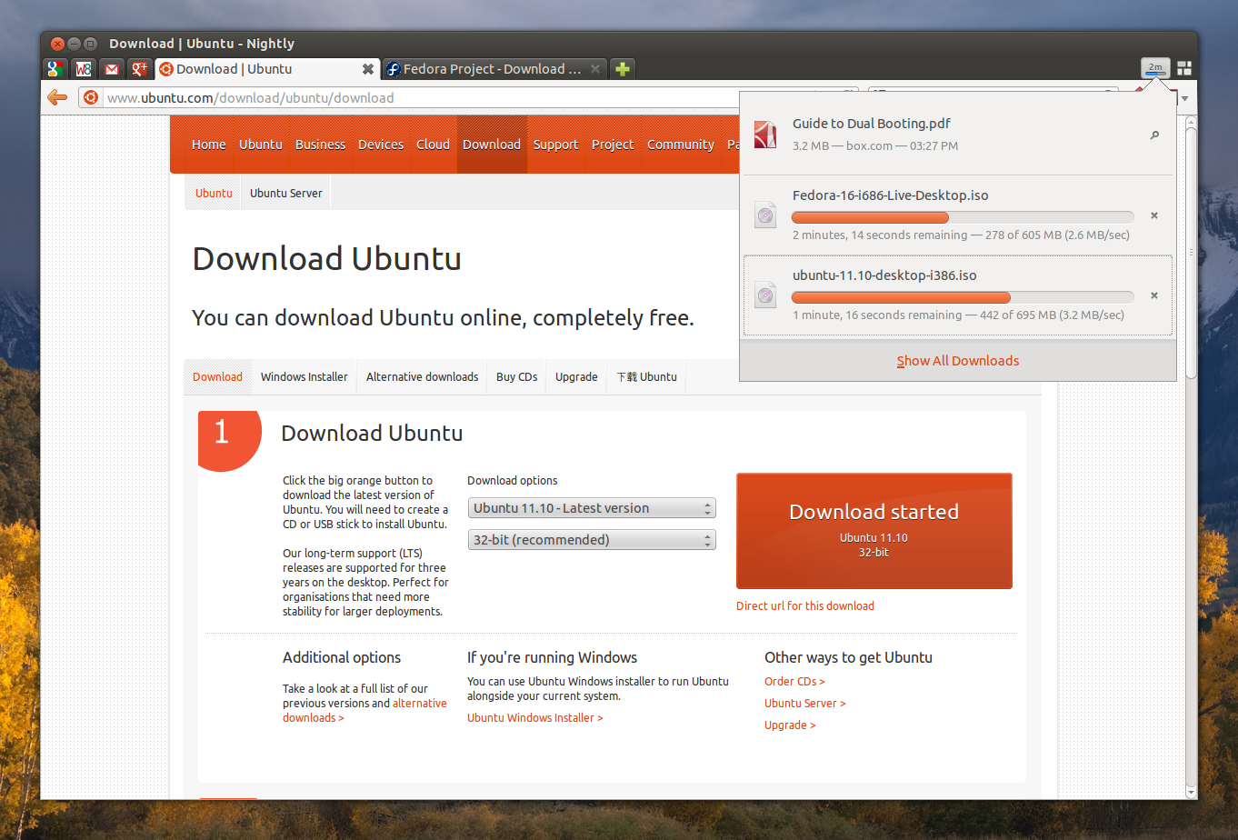
Compare the popular web browsers. Despite their convergence, the UI's are quite different.
And this deliberately confuses application content versus Internet content.
This might well be by design. As I understand it's a Mozilla goal to reduce the barrier between native apps and web apps. The Firefox GUI itself is even some sort of webpage (XUL)...
in-content means the preferences dialog get changed to a tab (à la Chrome). It's not about changing preferences to be per-site (there are some per-site prefs in right-click, view page info, permissions).
I really don't care for Firefox's new versioning scheme. I'm still on Firefox 10 on Gentoo, and I don't feel much of a reason to upgrade. I felt that incrementing that number should be reserved for major changes. I didn't intend for this to be taken as a complaint about the Mozilla development team. It's just something I've found unusual in the development community. It's been confusing me, and I never understood their reasoning behind it.
Major changes are occurring, especially regarding memory usage (and security bugs, so I seriously suggest you upgrade). Your main gripe is there isn't very many of them at each release, since they have changed development style. This kind of development style is what I'd call rolling release, "ship changes when they are ready", instead of the usual "ship changes in the next version". The classic version numbering fails with this kind of development style, since the differences between major/minor start to fall apart. Look at something like the linux kernel, which follows a rather similar system. Every new version adds major features, just not very many, but they build up over time. In fact, the major-minor meaning was so useless Linus could just change the version from 2.6 to 3 without any significant changes.
As a gentoo user, I would expect you to be very familiar with the rolling release paradigm. Personally I think it works well for something like Firefox. I'm pretty sure I'm getting way more major features per unit of time now then before, since the waiting time between releases was so long. There are definitely some disadvantages to this approach though, but the advantages are worth it.
Thank you for the detailed explanation of it. That's actually kind of fitting for them to do away with major/minor versions. I like the idea that they implement major changes quickly, and I'm currently compiling the latest Firefox.
No it really doesn't matter. It wasn't so much a complaint, and I didn't intend for it to seem that way. I just didn't understand the reasoning behind it. It's not something that I dislike about the Mozilla team. Just something that is unusual in the development community.
Perhaps, I hadn't thought that any significant security issues had been found in recent versions. Are there any I should be concerned about? If not, my reasoning is that I don't want to break what is working perfectly fine for me as is.
Why is it a good thing for the preferences pane have to appear in a different place from where it does in every single other application on my OS?
And this deliberately confuses application content versus Internet content. Do you have to scroll down to click "OK"? What if it isn't visible? Or should it be labelled "save"? Why learn a new dialog-style interface? And why on Earth does this need to be a tab -- are people going to be tabbing between their stock quotes, news, and browser Preferences tab?